Briefcase
BRANDING
The client
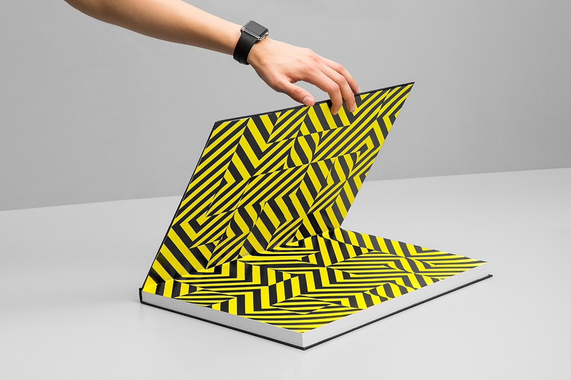
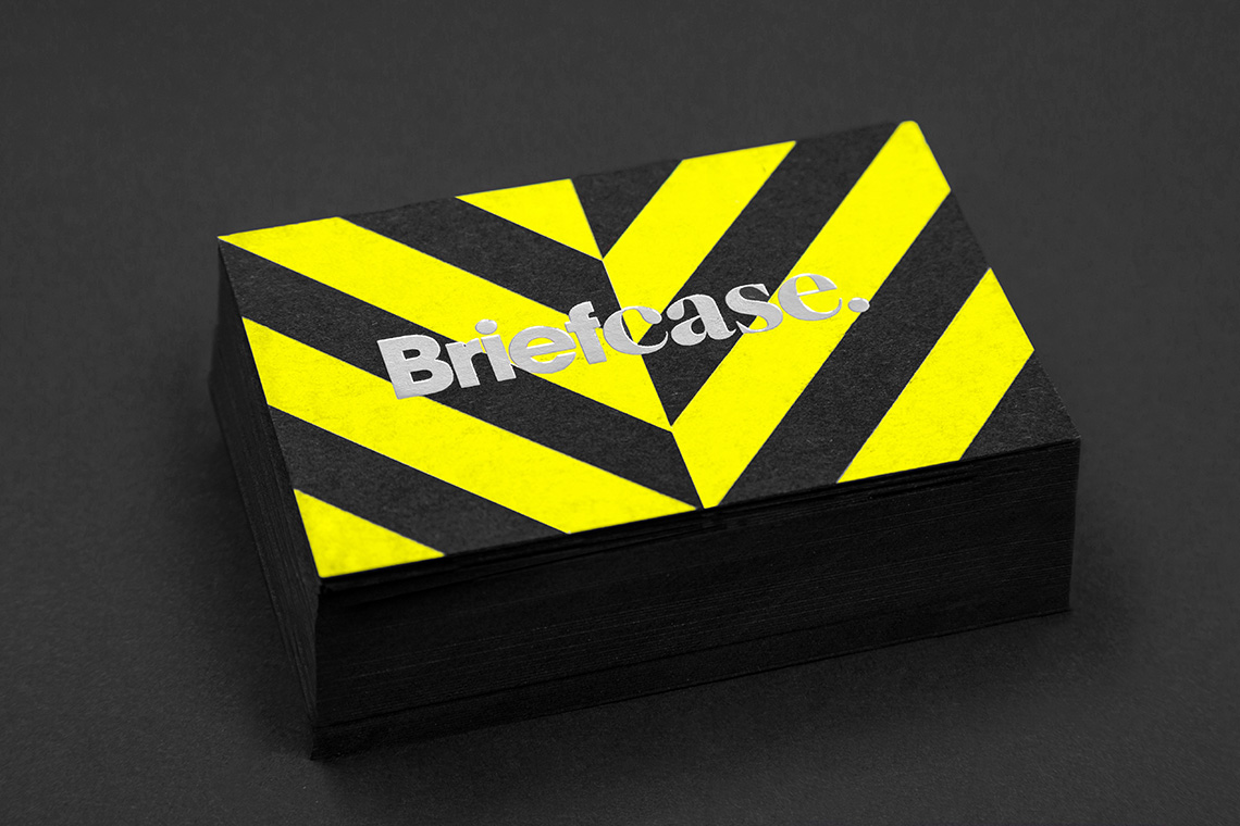
Briefcase is an industrial design studio located in Mexico City that applies their projects as interventions in urban spaces. The studio focuses in open spaces and urban areas, which served as inspiration during the brand’s development.
keywords
Entretenimiento/ Branding/ Graphic design/ Web design
the objective
Create a brand that differentiates the studio from competitors and focus its experience in projects of urban character
the solution
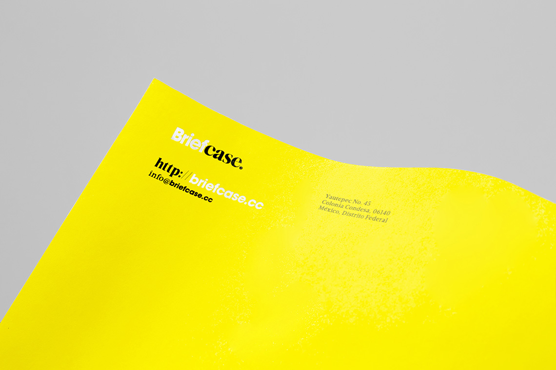
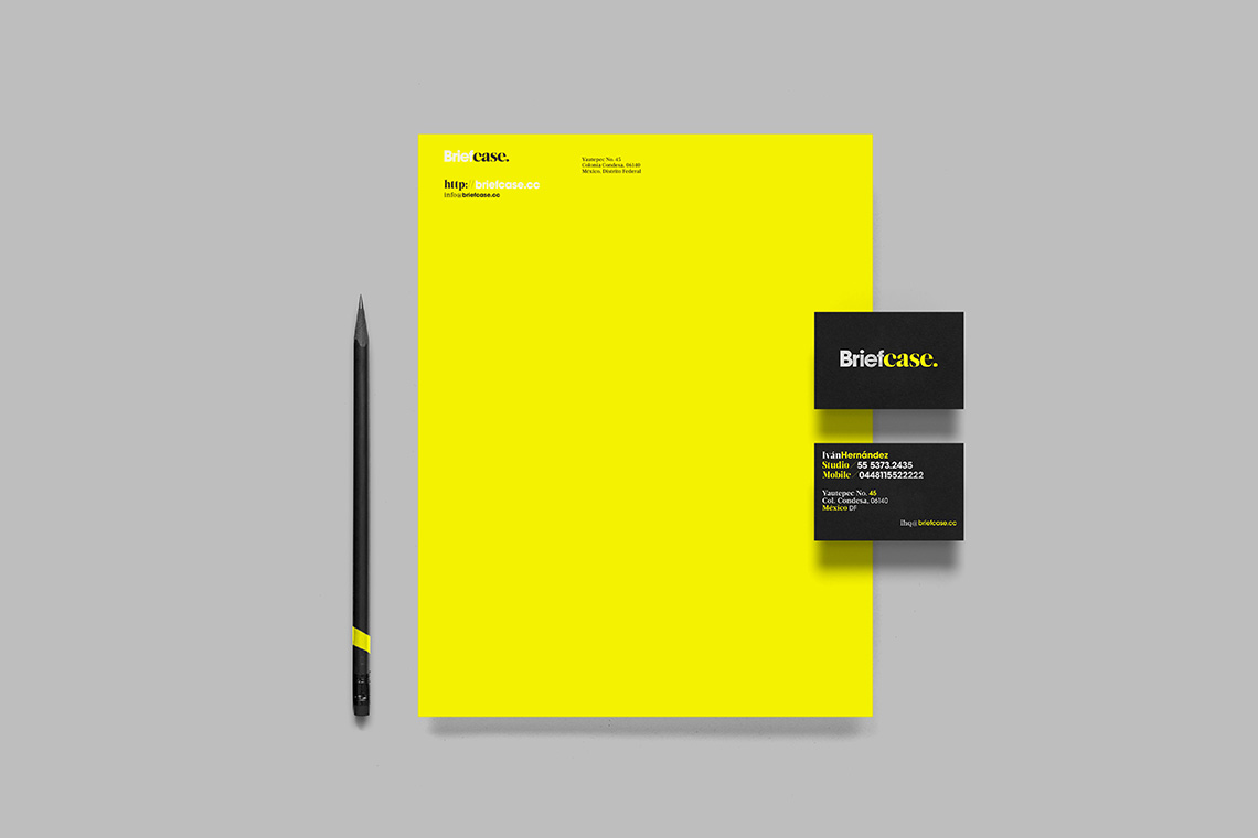
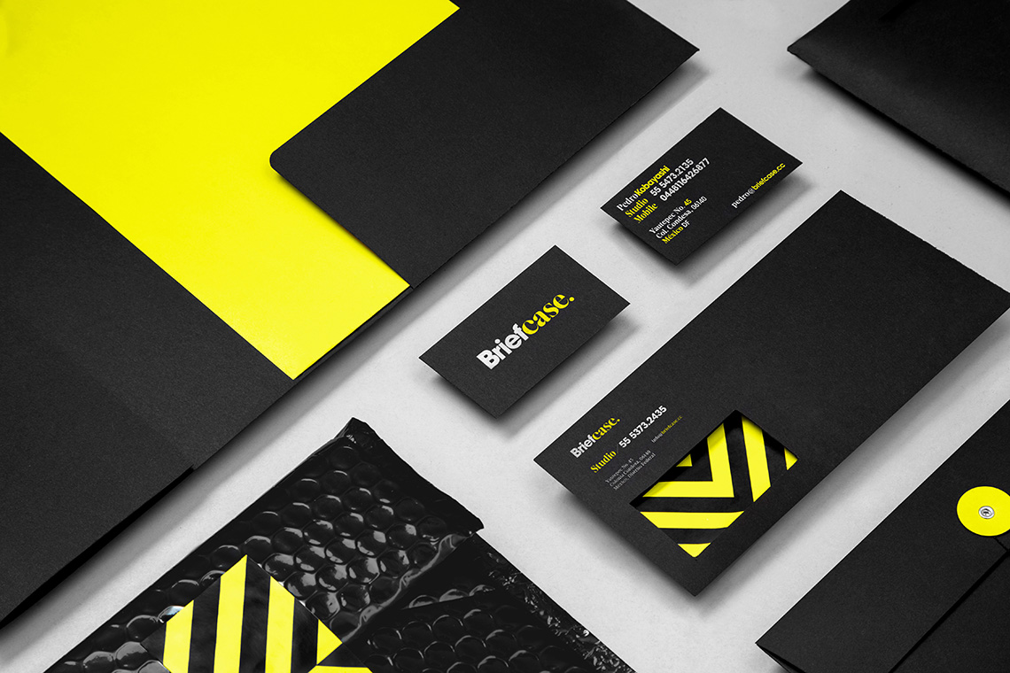
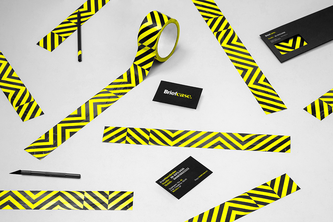
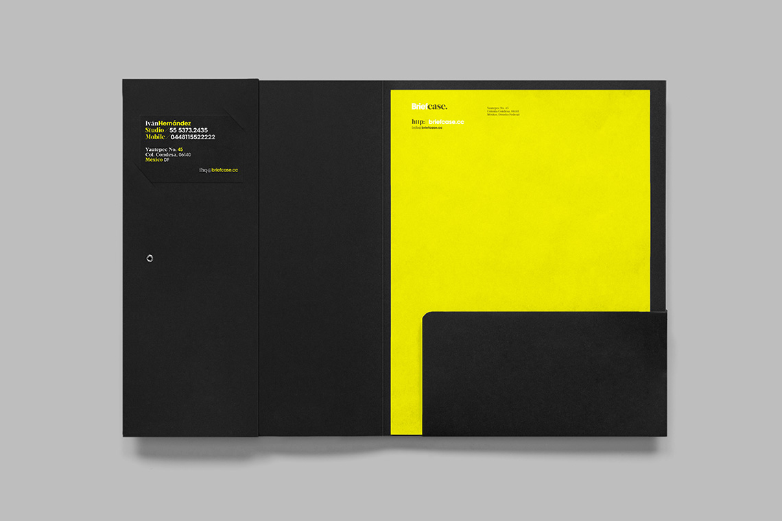
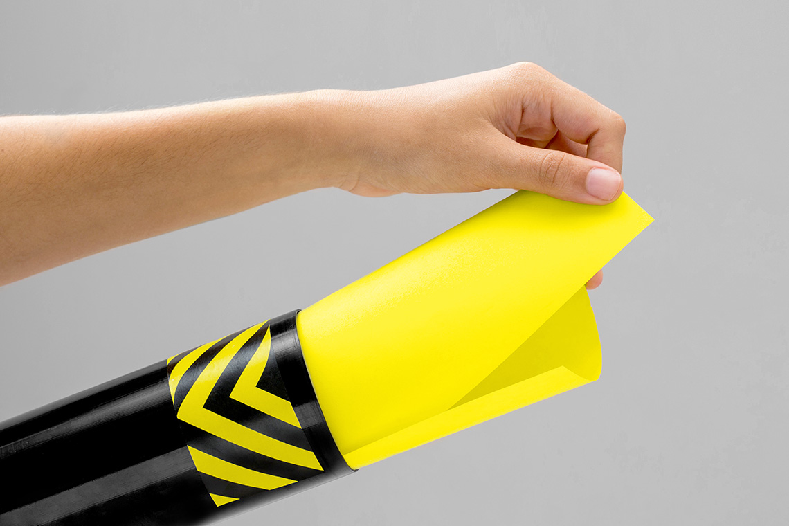
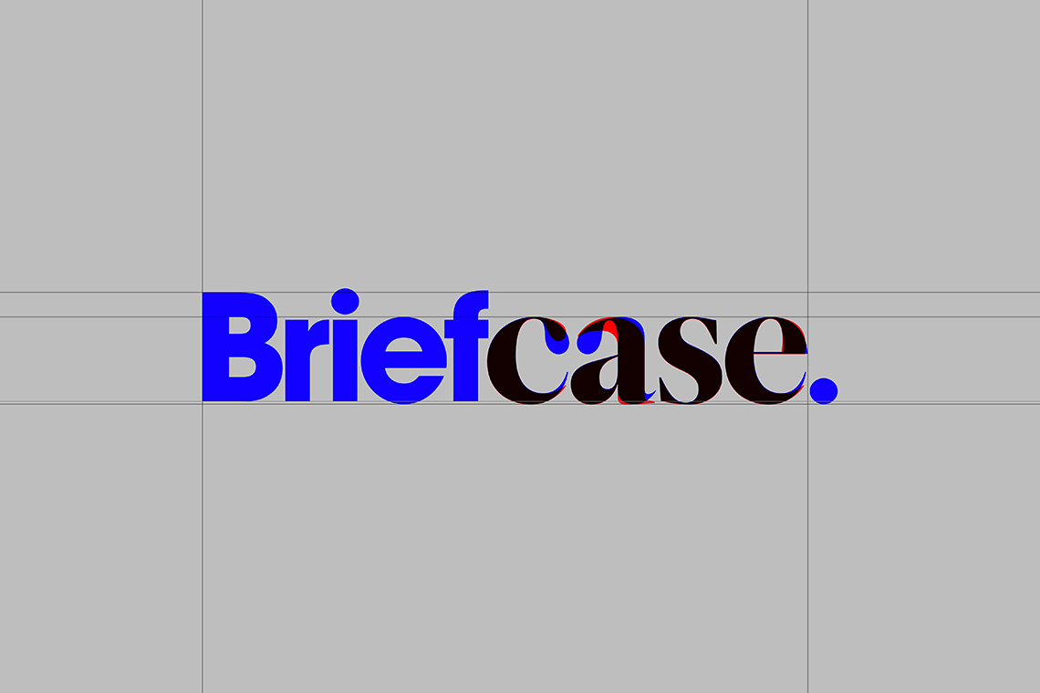
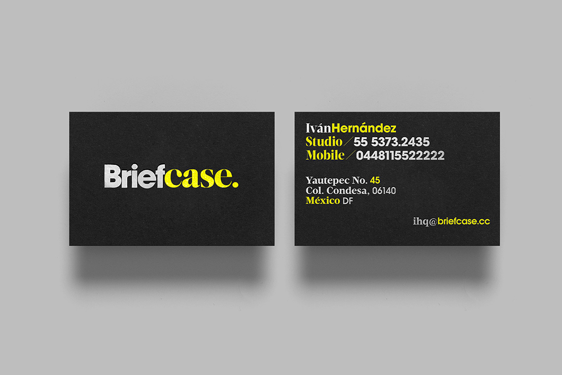
The logotype alludes to the fusion and duality between two personalities and philosophies. These are taken to form one single graphic expression that is both modern and timeless. Urban landscapes inspired the stationary and the layouts present throughout the brand’s elements. The contrasting typography and colors, such as the bright yellow, aim to imitate open spaces and the signage that is seen in cities, as well as other elements, all of which reflect Briefcase’s work. — (A)
The logotype alludes to the fusion and duality between two personalities and philosophies.