Eight
BRANDING
The client
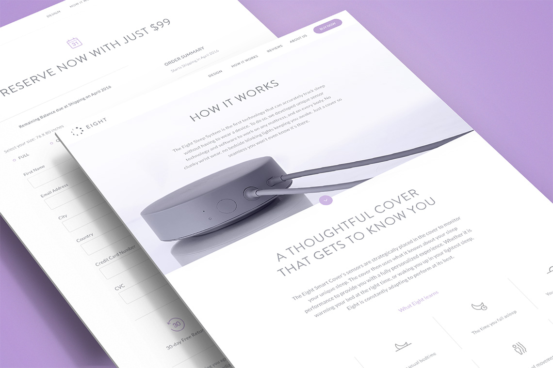
Launched in 2014, Eight is the first technology based sleep-tracking company without a wearable device. Its device senses and analyzes data such as breathing rate, slept hours, and bed warming to maximize comfort while sleeping. Eight utilizes all the data it tracks to build a blueprint of individual sleeping patterns compiled into sleep metrics conveniently located within a personalized mobile application. Usage of the Eight app helps guide the advancement of your sleep experience.
keywords
Technology/ Interaction Design/ UI/ UX/ Icon Design
the objective
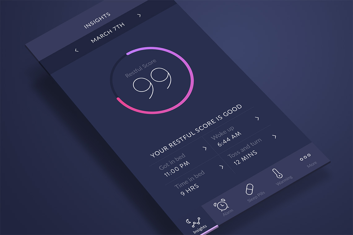
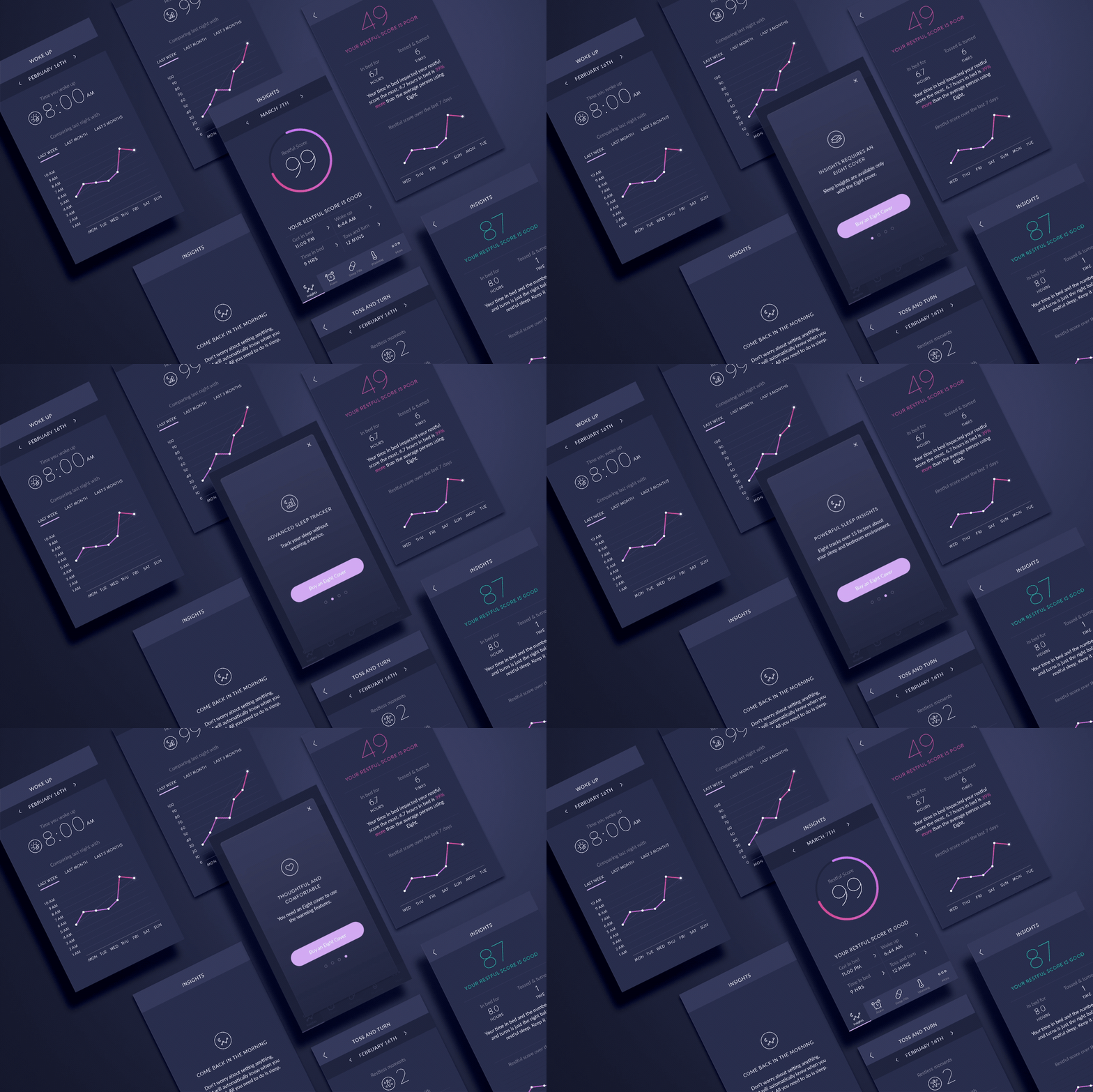
Eight's app re-design needed to be developed planning for it to be used within a sleep inducing environment.
the solution
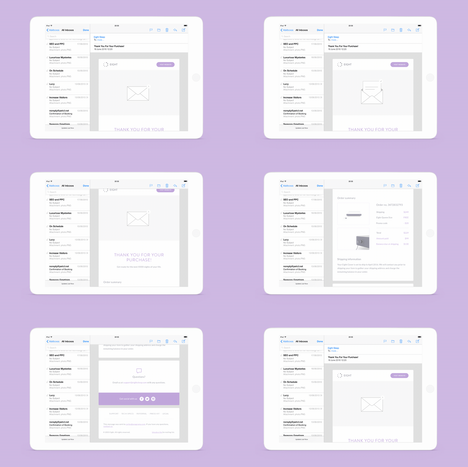
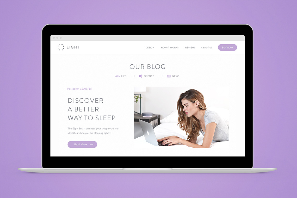
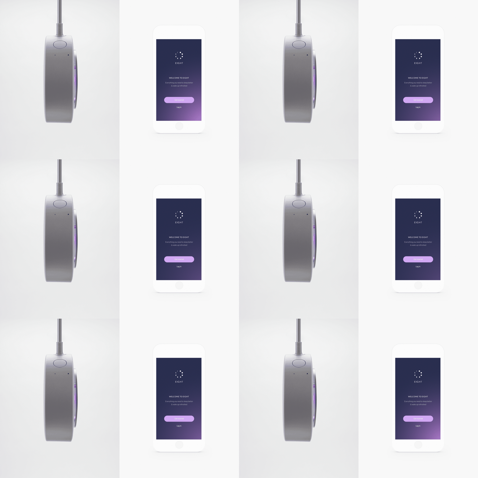
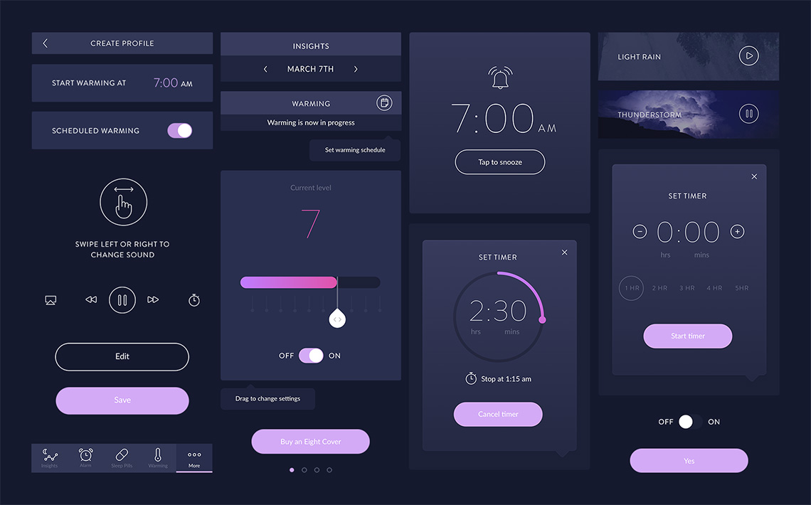
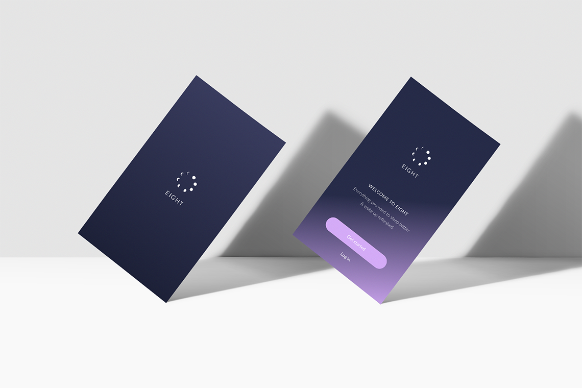
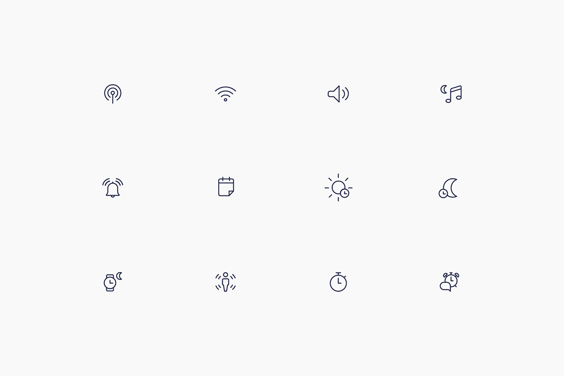
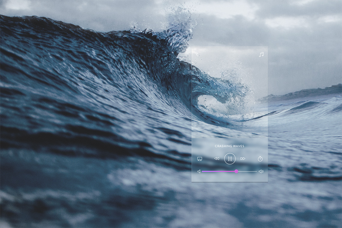
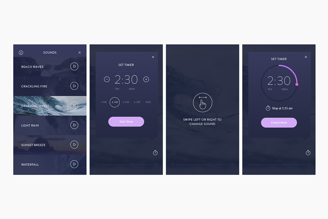
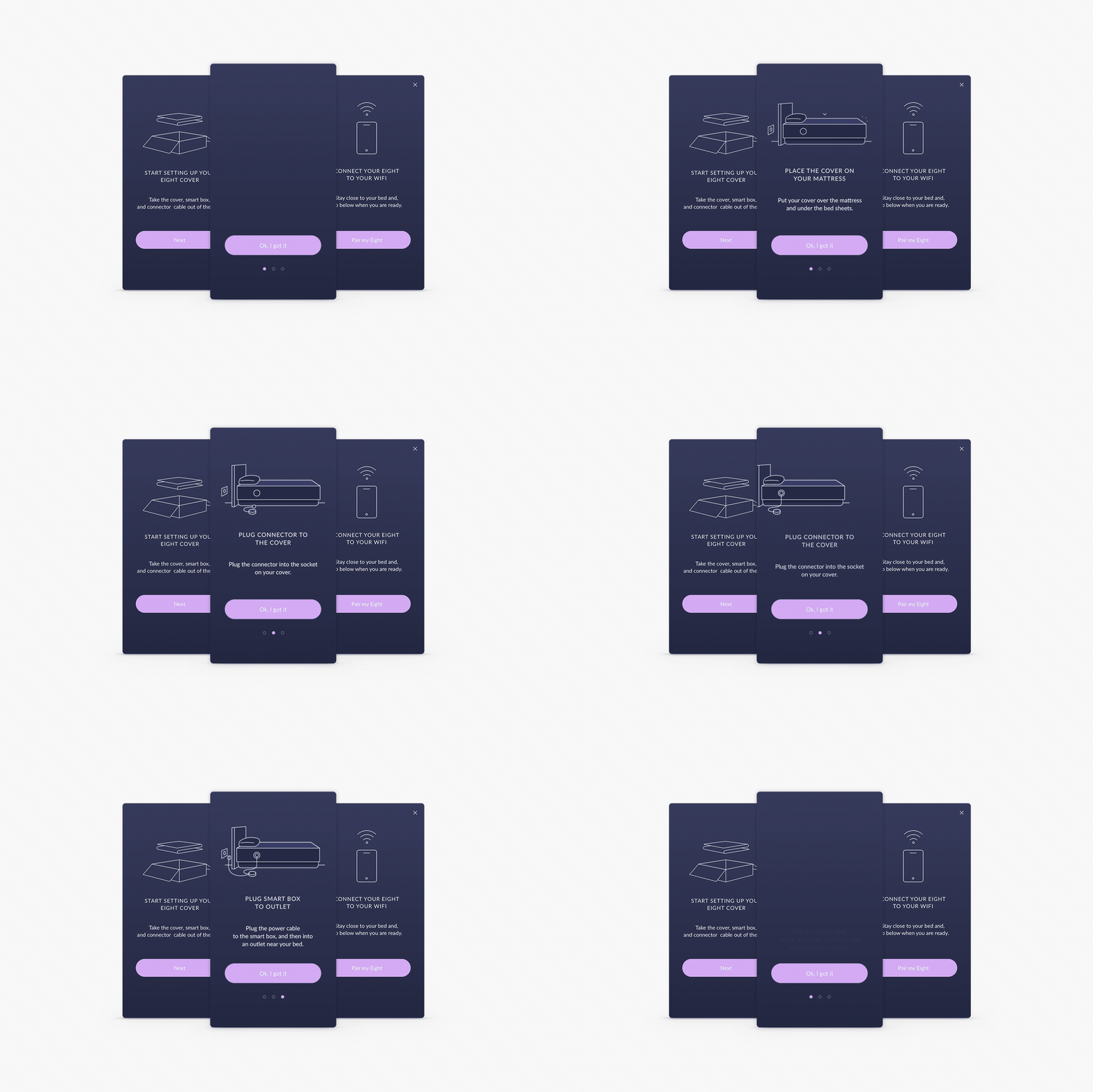
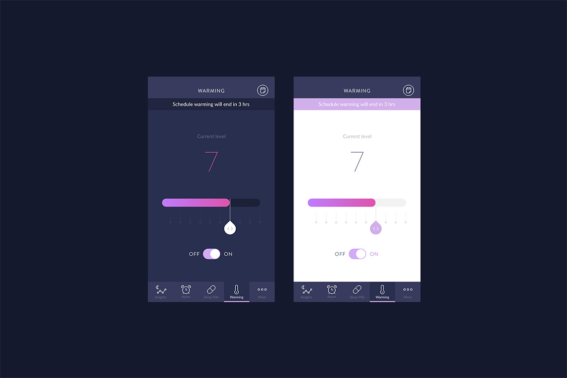
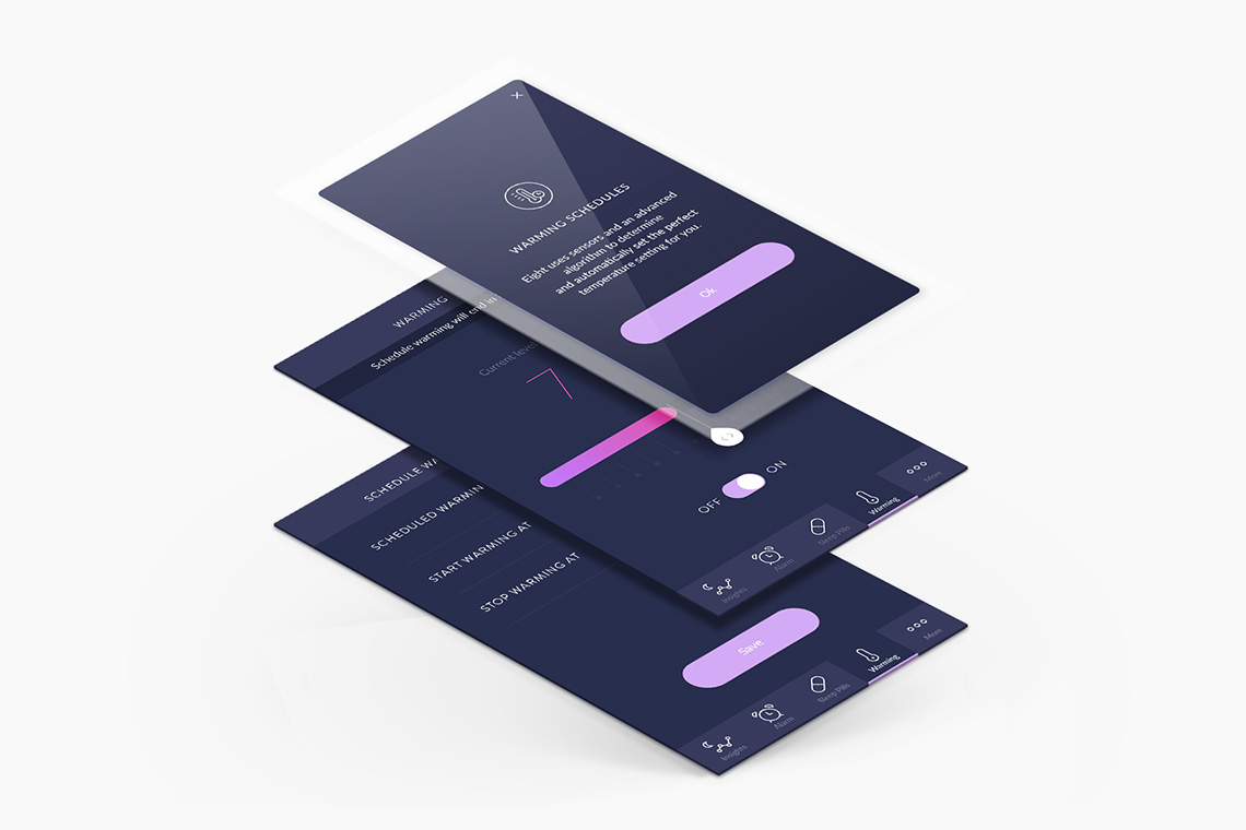
We employed a dark toned palette and included gradients representing the dawn and sunset. The app includes comfort features such as Smart Home integrations, White Noise Player, and Smart Alarm. All connectivity features can be activated with a simple swipe within the Eight app. — (A)
Gradients represent the dawn and sunset.
Eight
Interactive
the objective
To create a brand that is able to carry on the company's message: the importance of a great night's sleep.
the solution
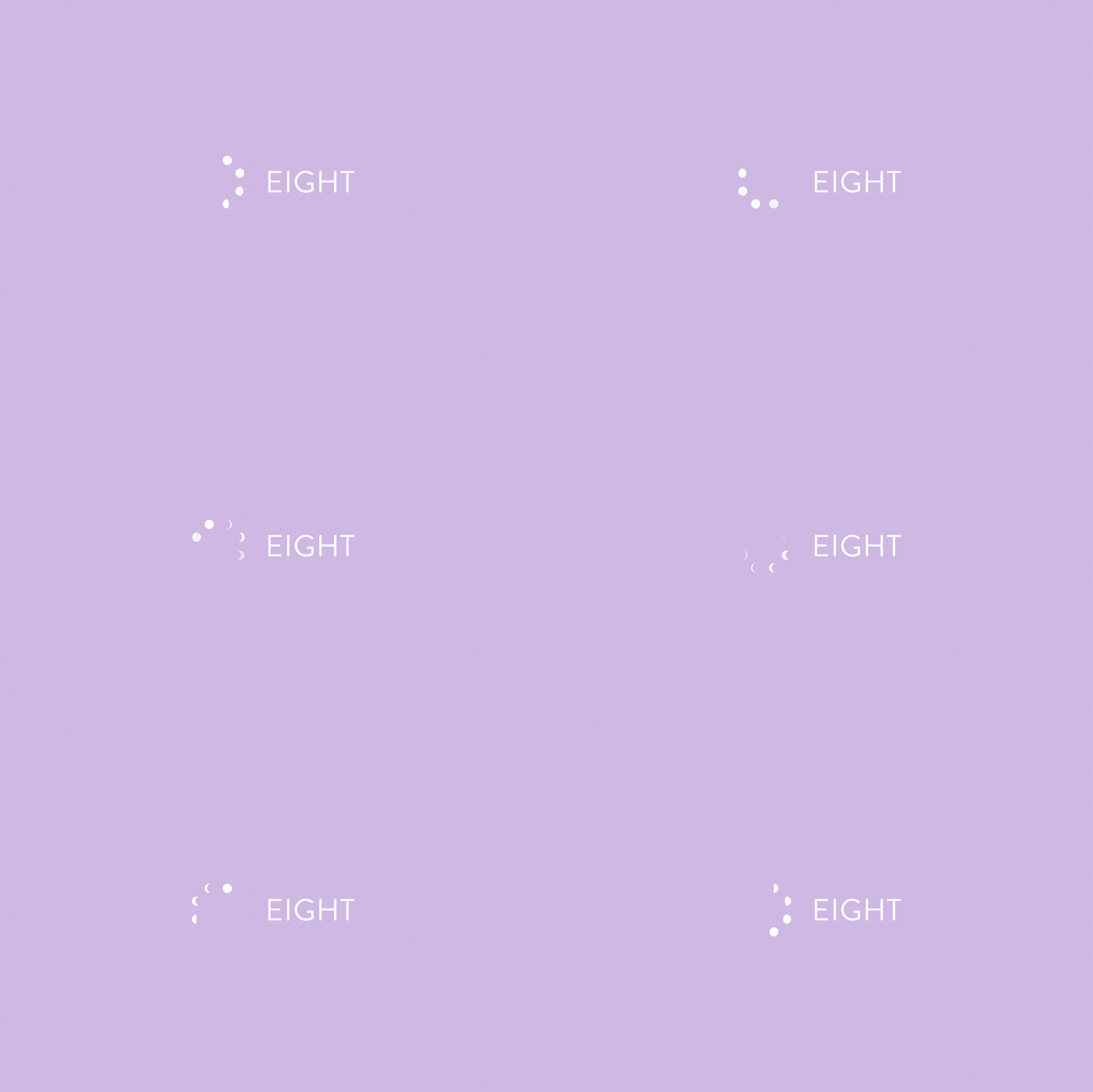
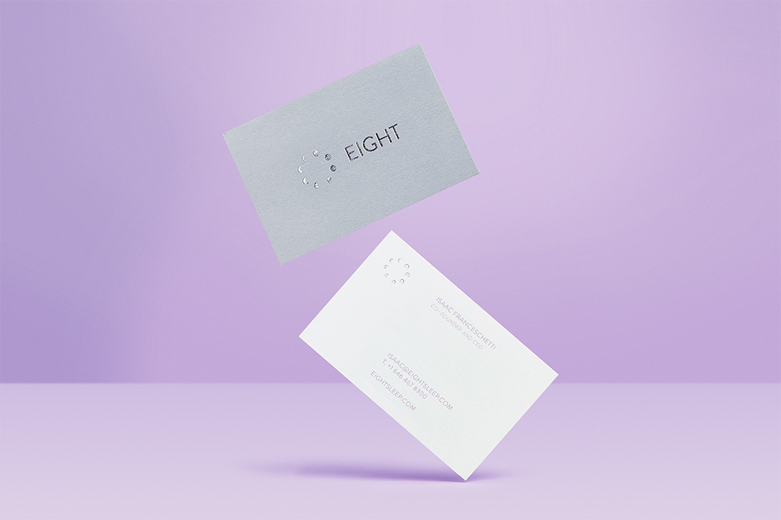
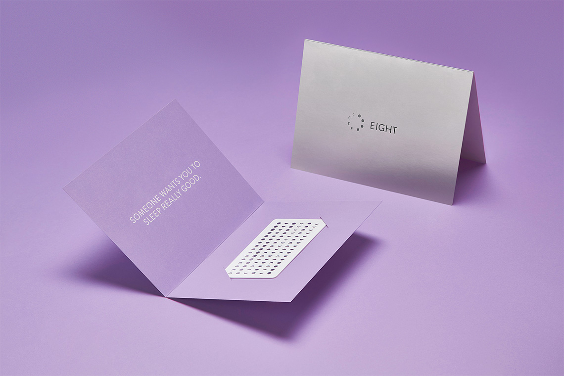
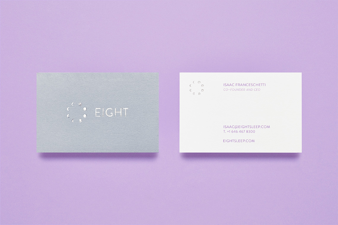
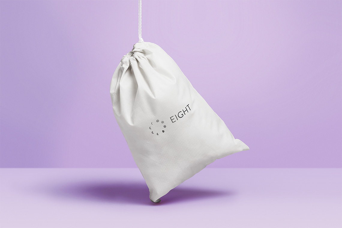
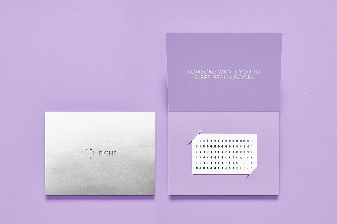
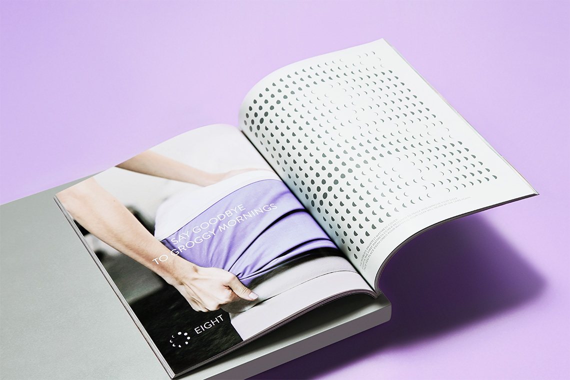
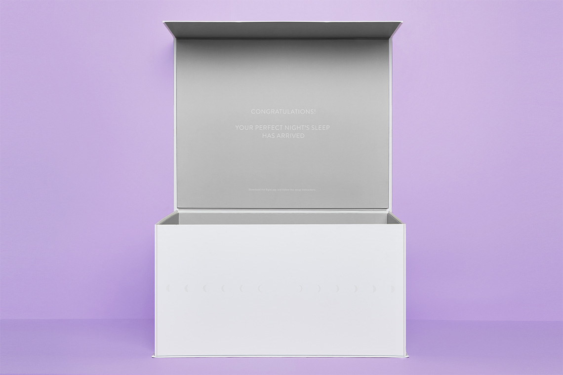
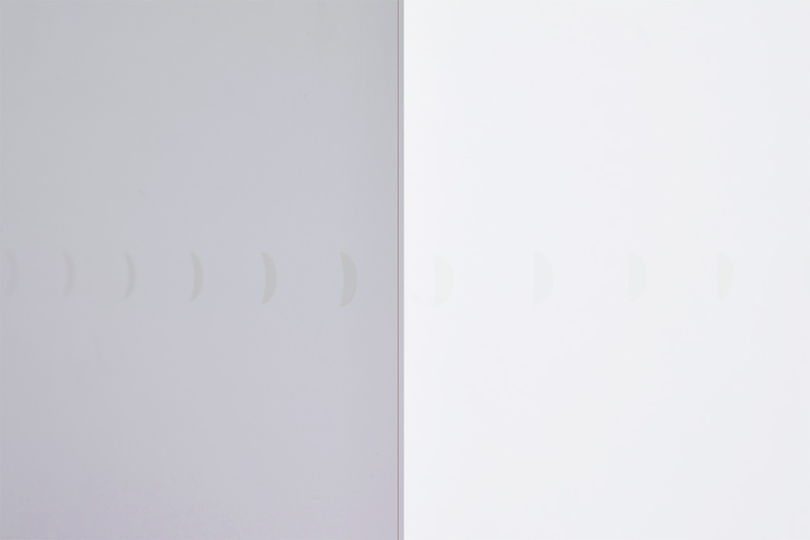
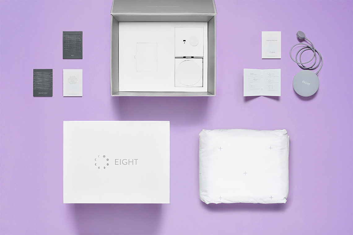
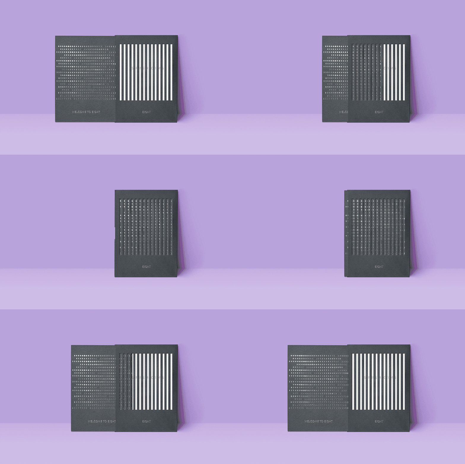
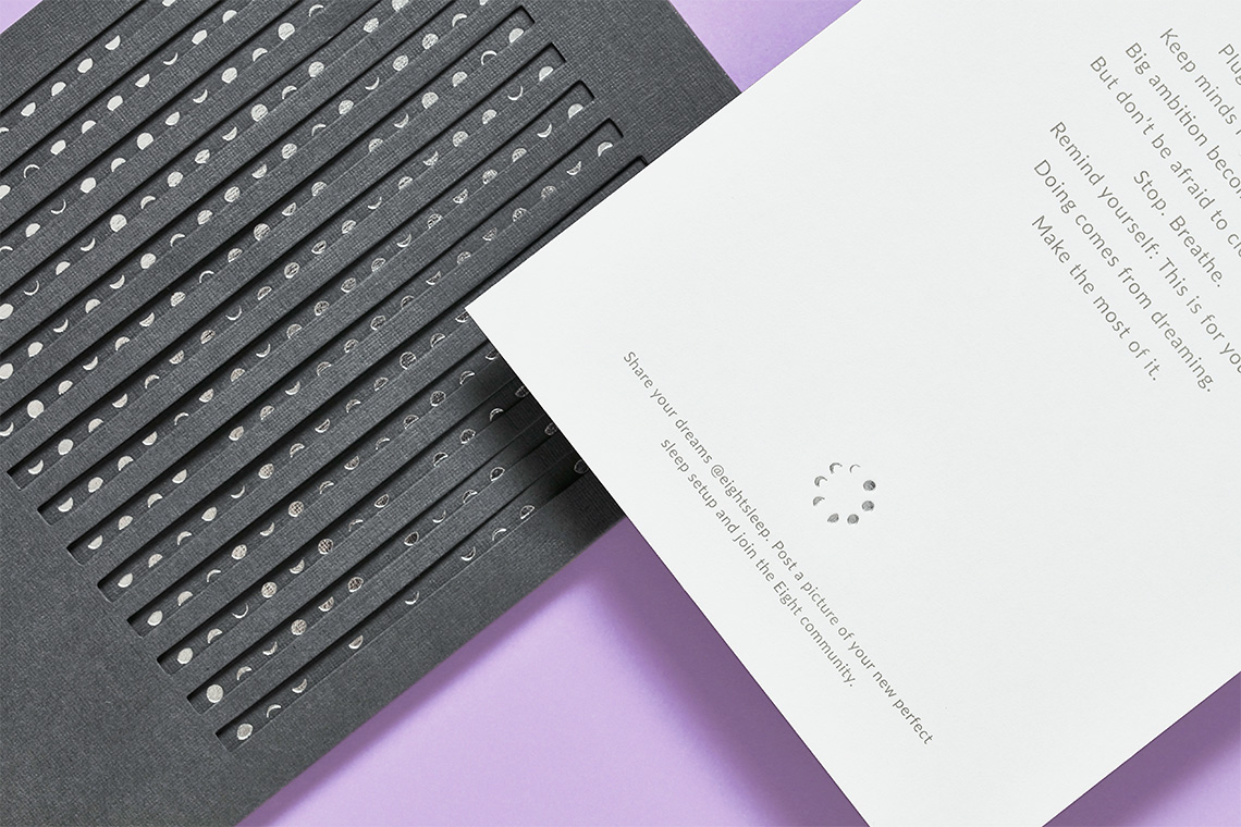
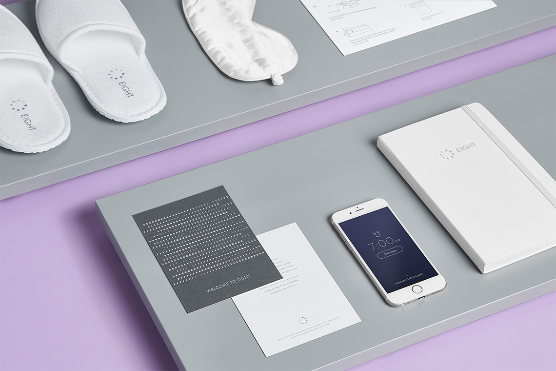
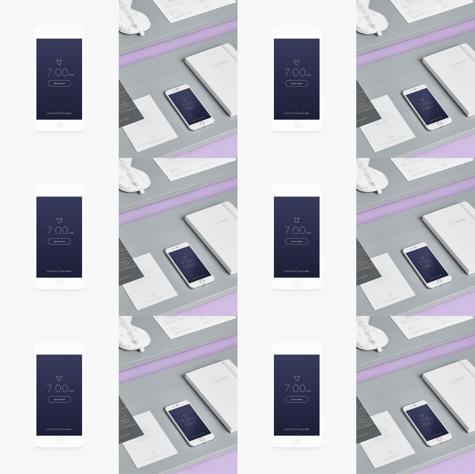
Eight's new identity is inspired by the moon cycle appropriating its phases from a new moon all the way to a waning crescent while the name emphasises the eight ideal hours of sleep a person requires.
The brand reinforces the importance of liberating the mind of resting arrangements while working on recharging the body through the essential needed sleep hours.
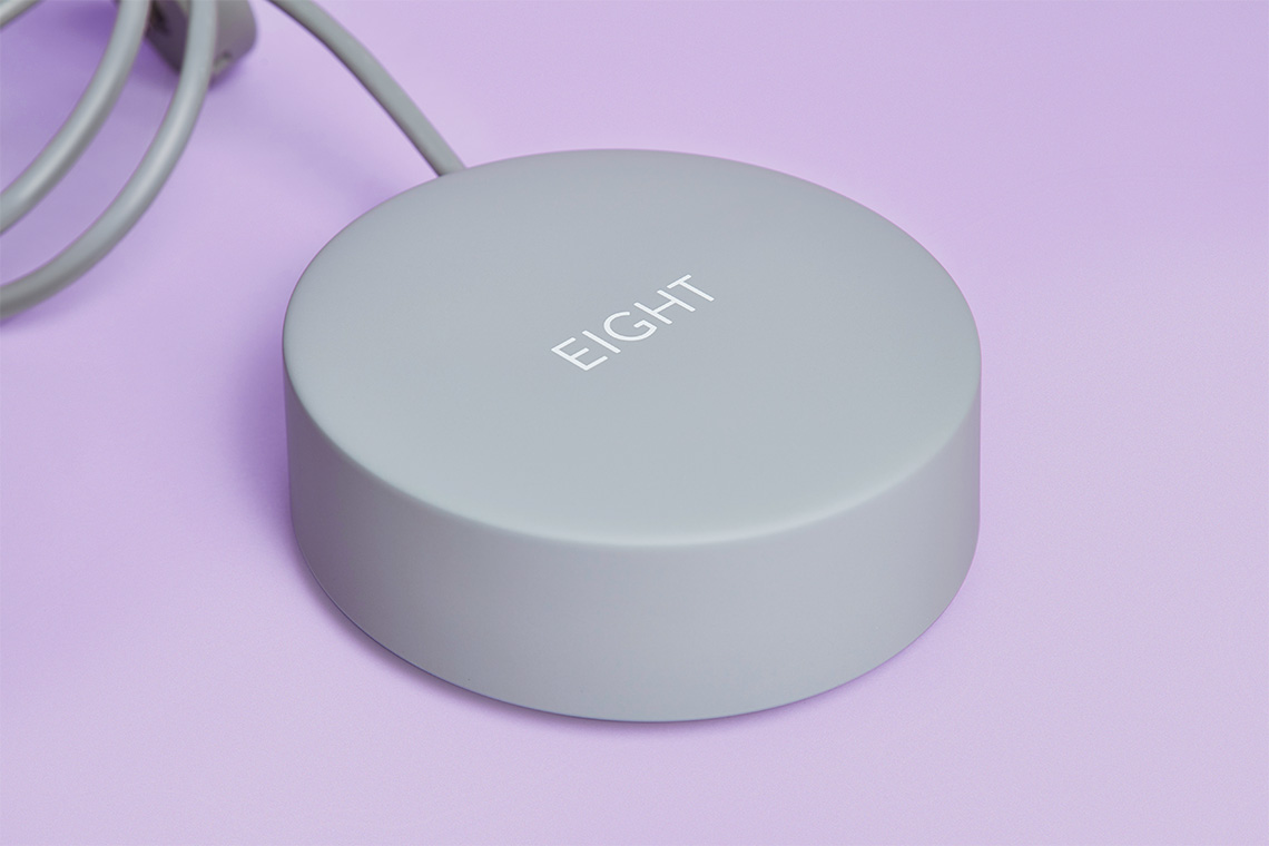
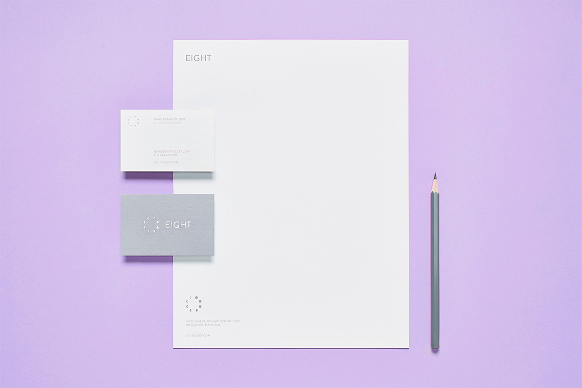
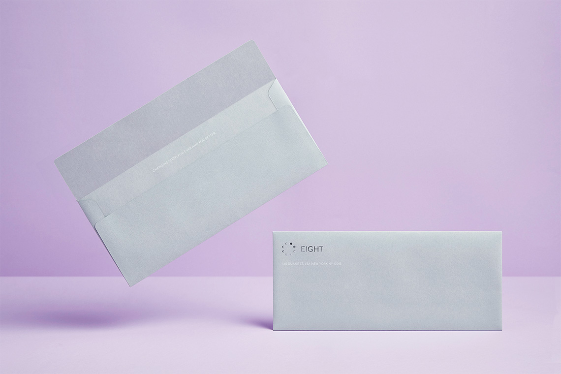
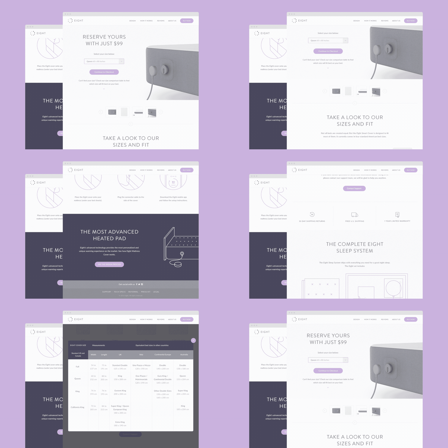
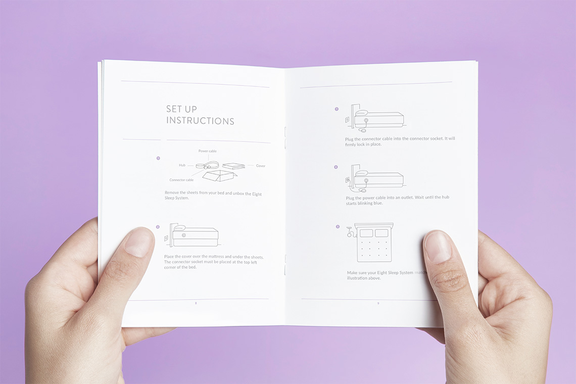
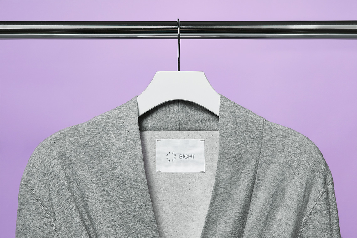
The redesign included a color palette choice of whites and greys accentuating a light purple color commonly associated with calm and peacefulness. — (A)
Eight's new identity is inspired by the moon cycle appropriating its phases
