Making Horror
BRANDING
The client
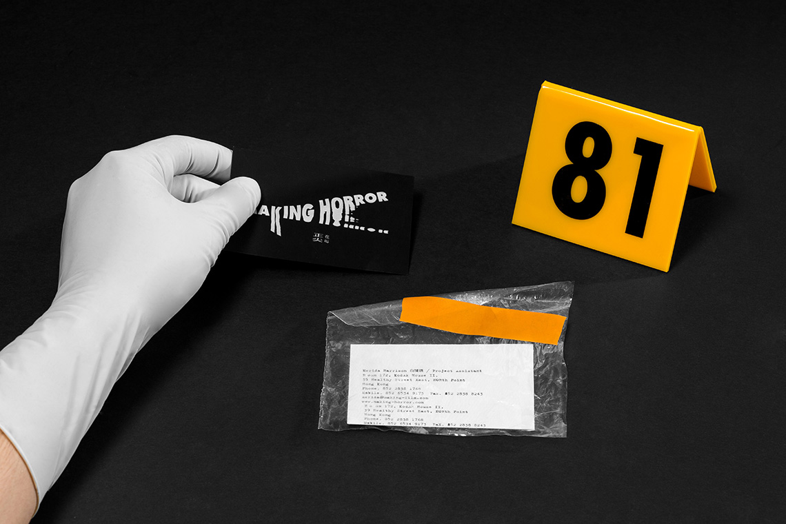
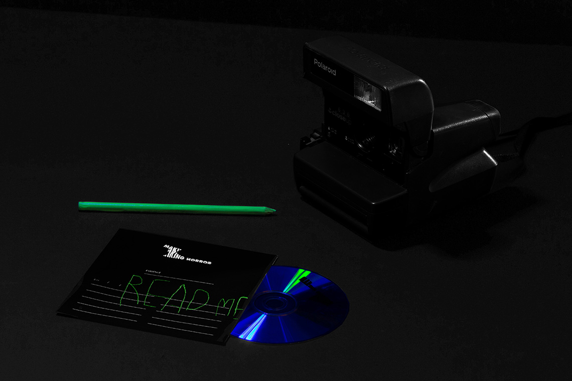
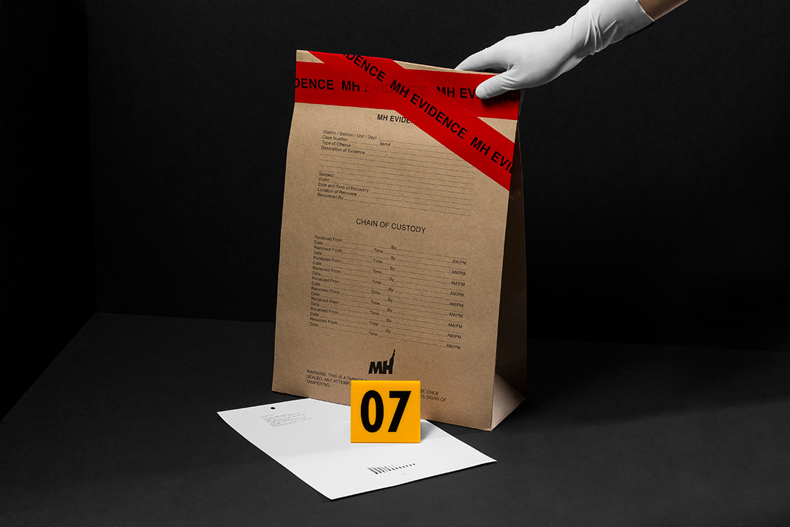
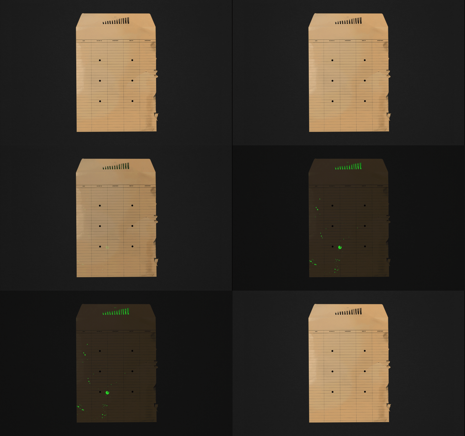
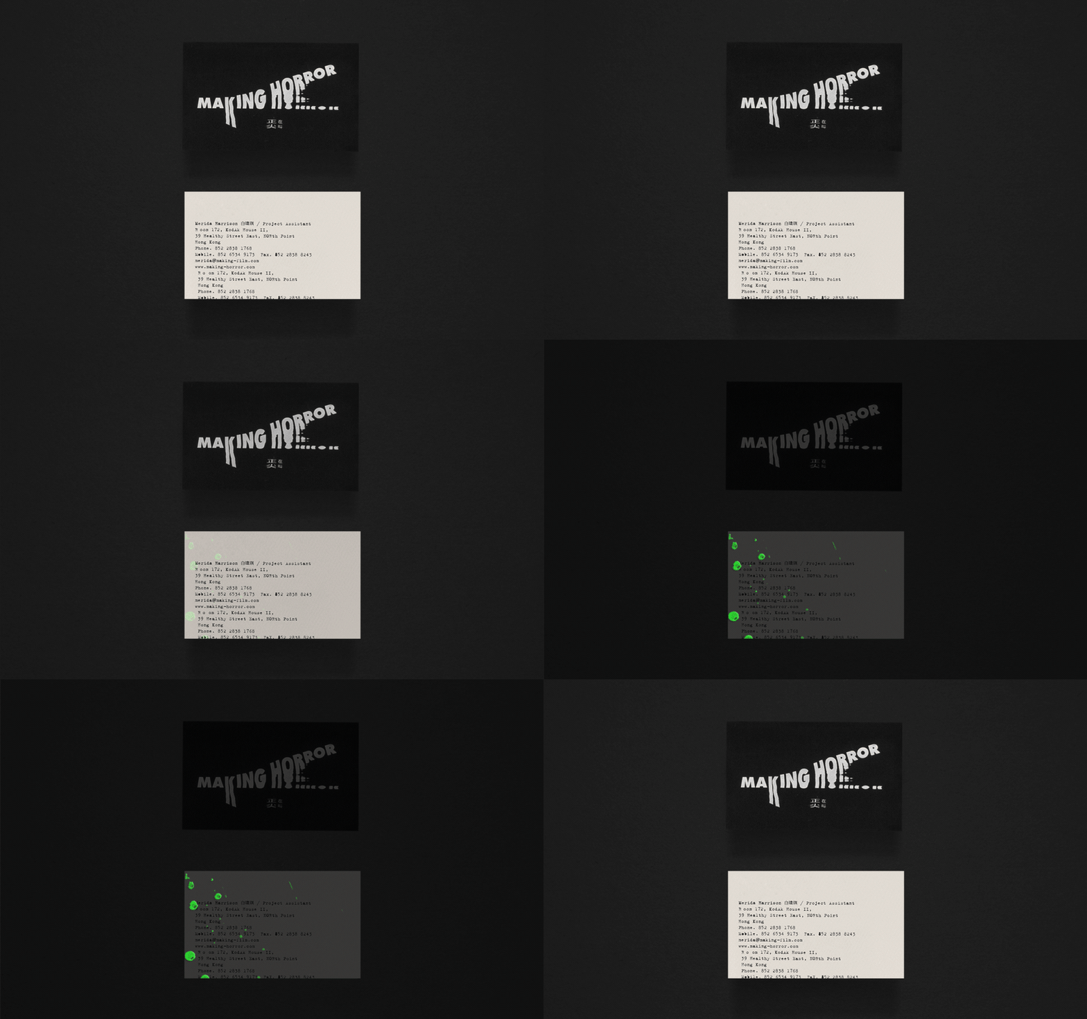
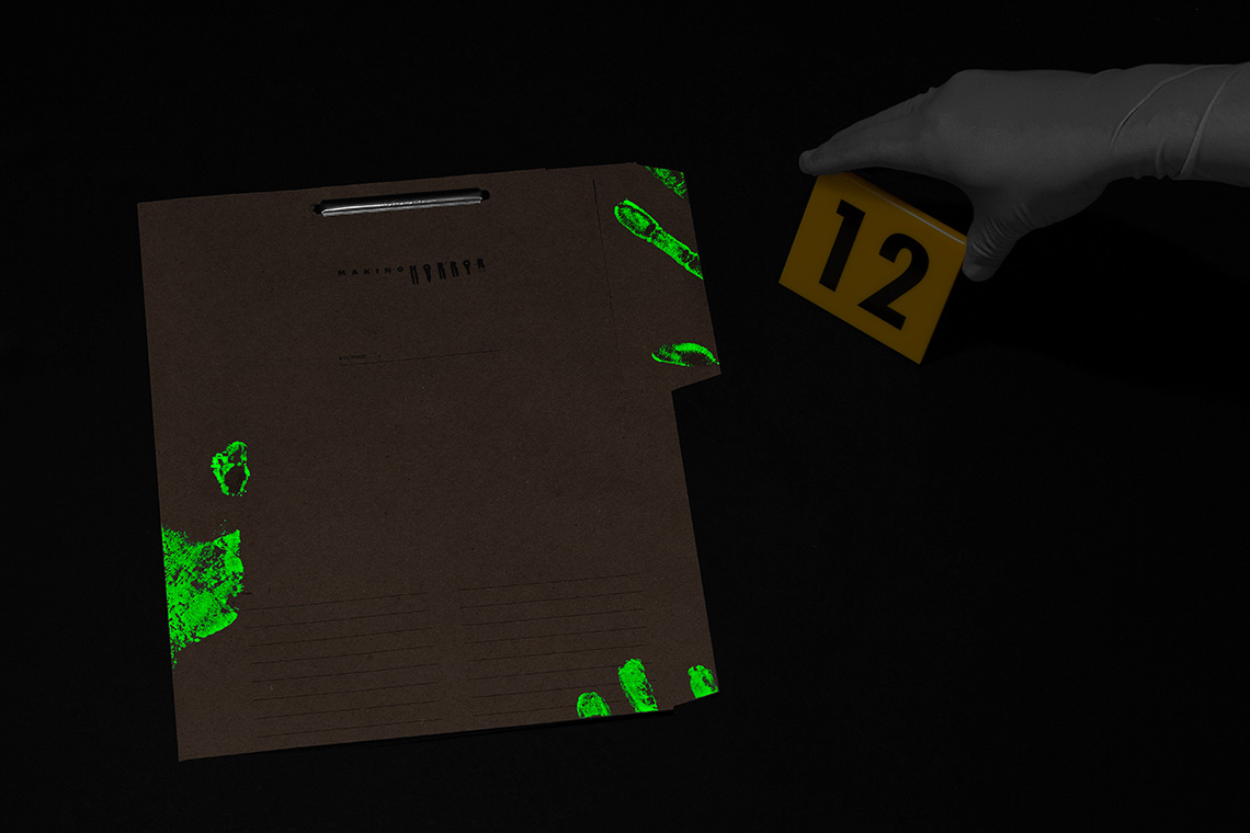
Making Horror is a new film label that focuses on horror and thriller films, based in Hong Kong. The brand tells a story portrayed through a forensic detective’s eyes, implicitly presenting elements of terror and mystery through the use of crime scene components.
keywords
Cinematography/ Hong Kong/ Branding/ Graphic Design/ Packaging
the objective
VIsually communicate the studio's cinematic expertise in the horror industry while make a memorable brand experience
the solution
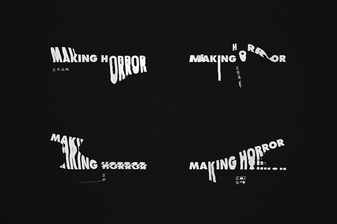
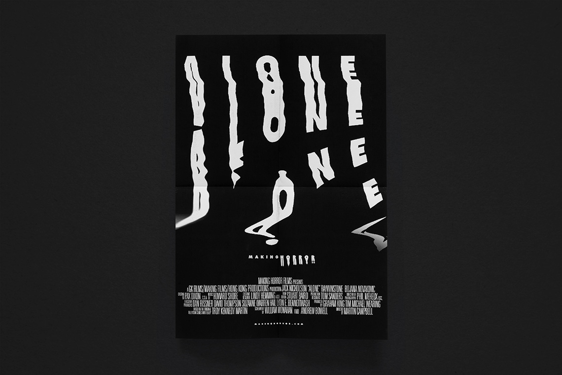
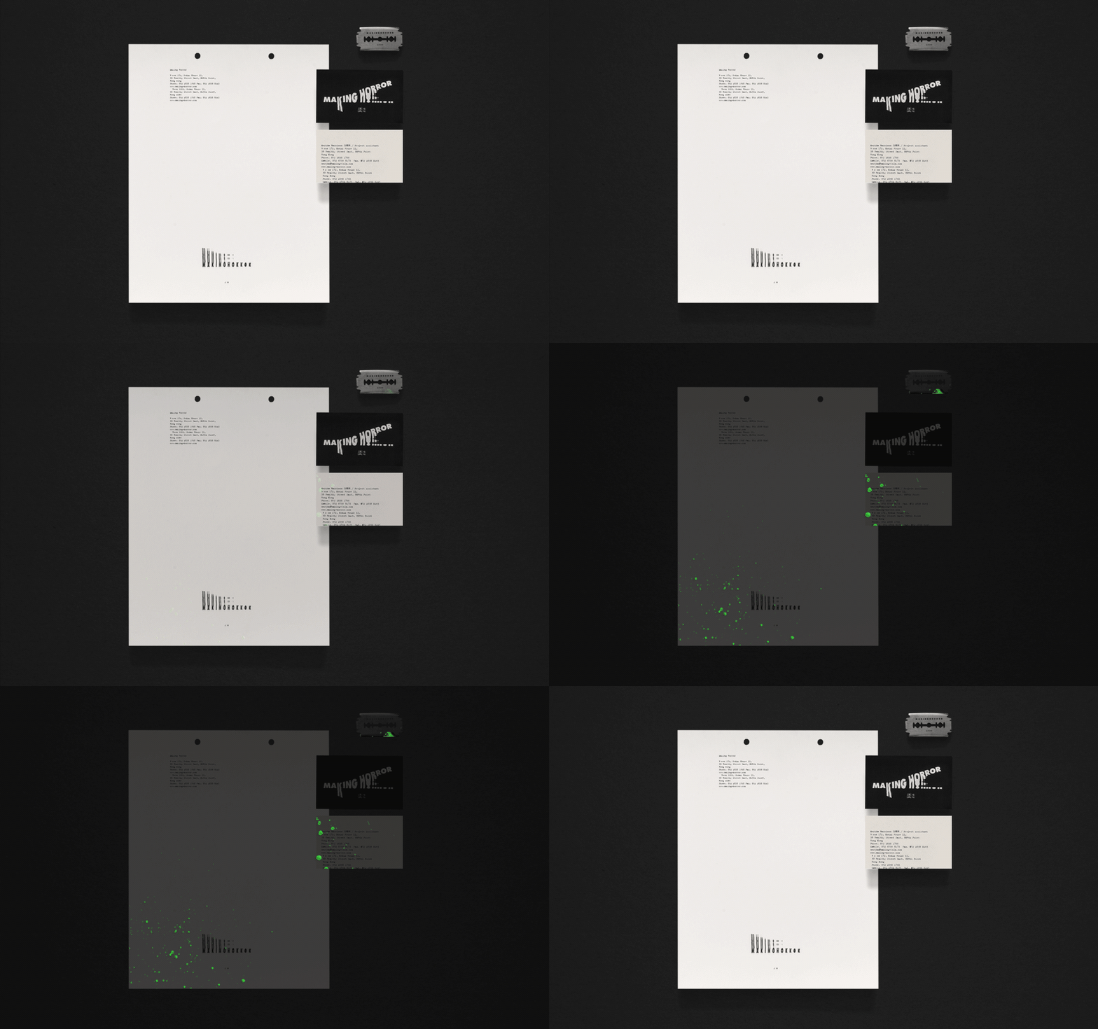
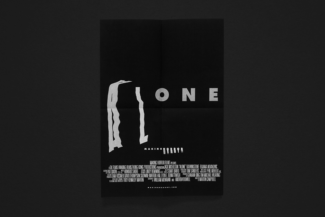
The logo portrays the fine line between order and madness by creating a structured typeface that is then inconsistently distorted. The distortions create logo variations that are then used throughout the brand’s print and video media.
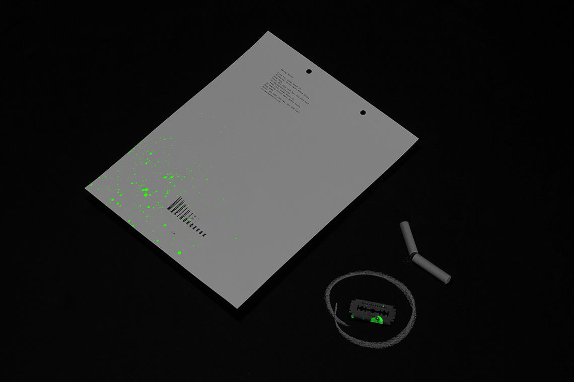
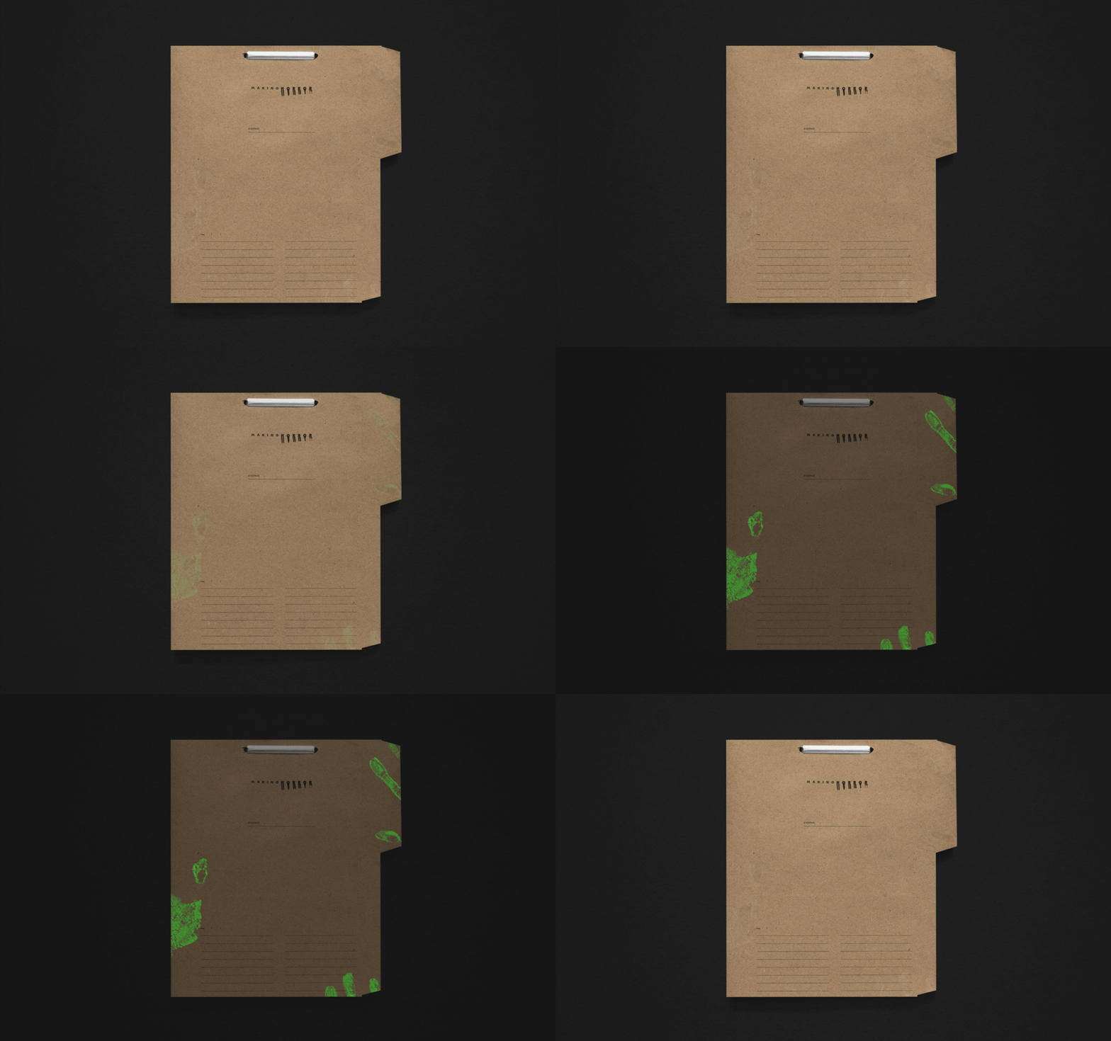
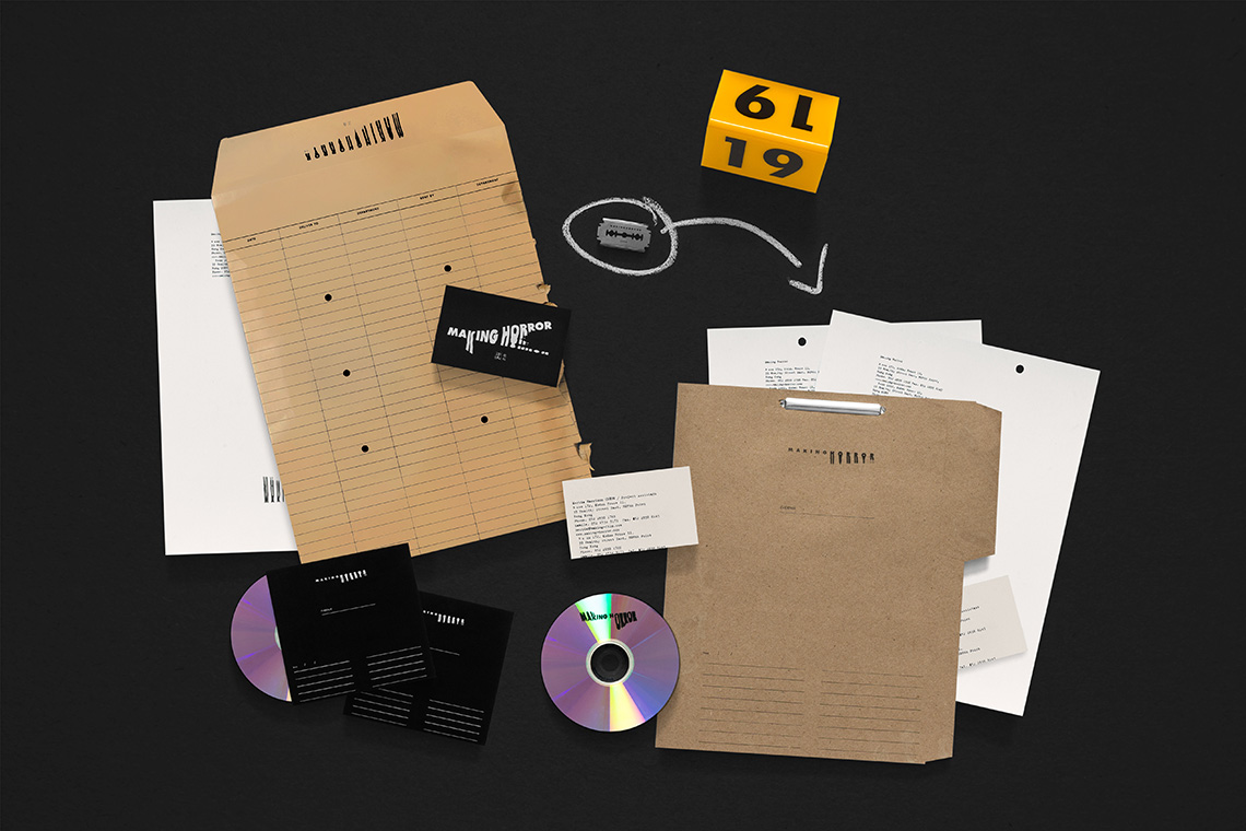
Incorporating the characteristic elements of horror and thriller firms the brand adopted a psychotic personality made present through the stationary by repeating lines and typos. — (A)
The logo portrays the fine line between order and madness
