Black Cube
Interactive

The client
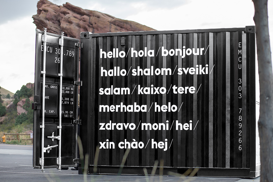
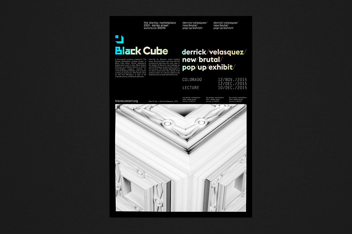
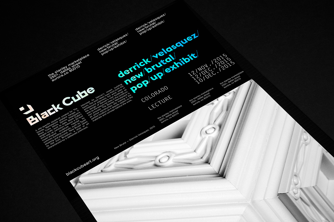
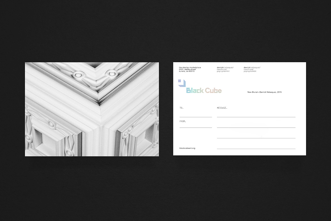
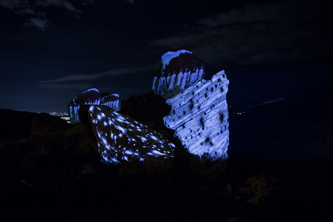
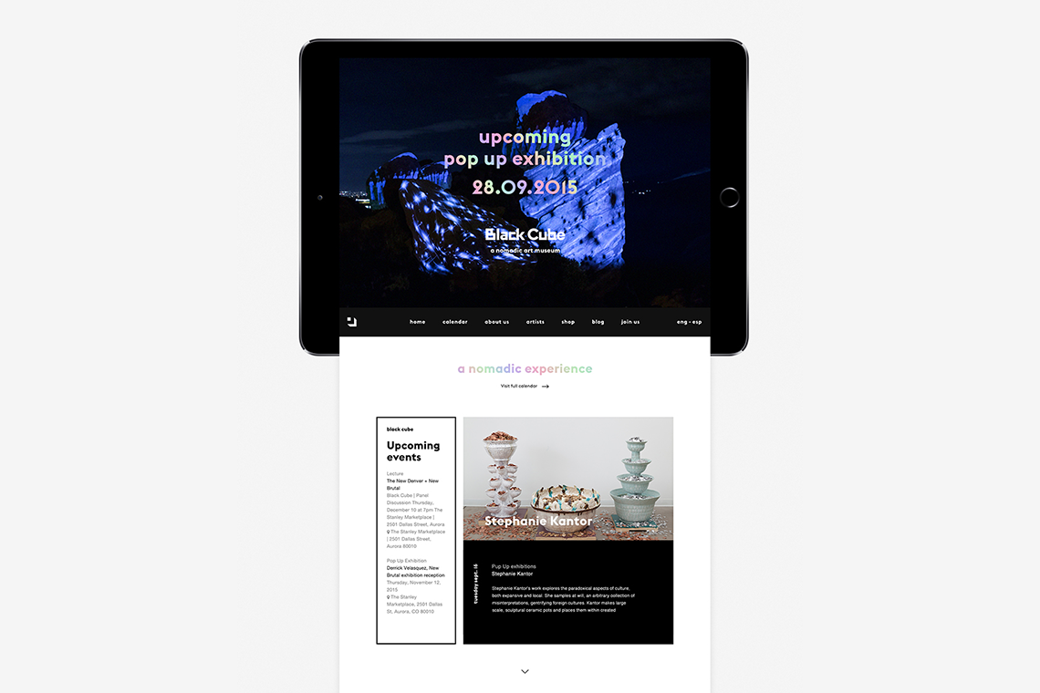
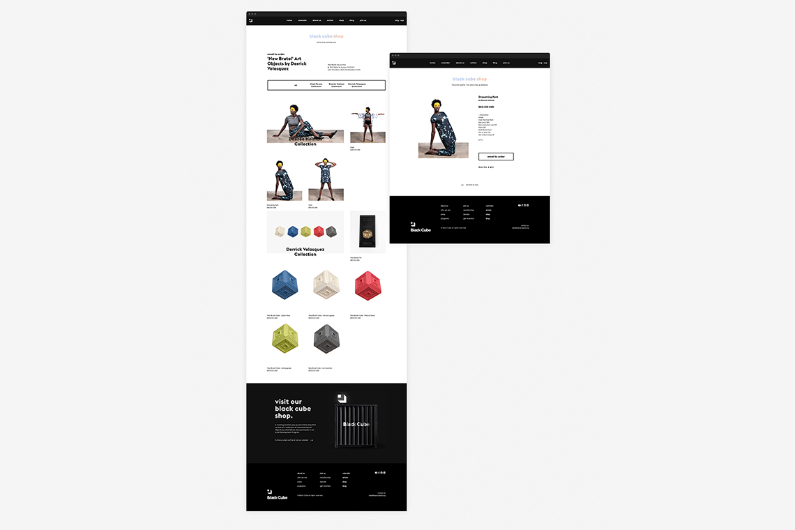
Black Cube is an experimental art museum that operates nomadically, celebrating art around the world by bringing it close to its spectators and their everyday lives. Black Cube finds itself in constant movement by bringing art and exploring new emerging ideas around the world without the boundaries of a permanent physical location. It collaborates with individual artists, showcasing their work and promoting art appreciation in an accessible and relaxed environment. The black container, which served as inspiration for the project name, travels along for pop-up art exhibitions and functions as the museum’s shop carrying collectible pieces and conceptual objects based on Black Cube's current exhibitions.
keywords
Museum/ Branding/ Exhibition design/ Graphic design/ Interaction design/ UI/ UX/ Web design
the objective
To design an interactive experience based on the versatile branding system, creating a special bond between the spectators and the museum.
the solution
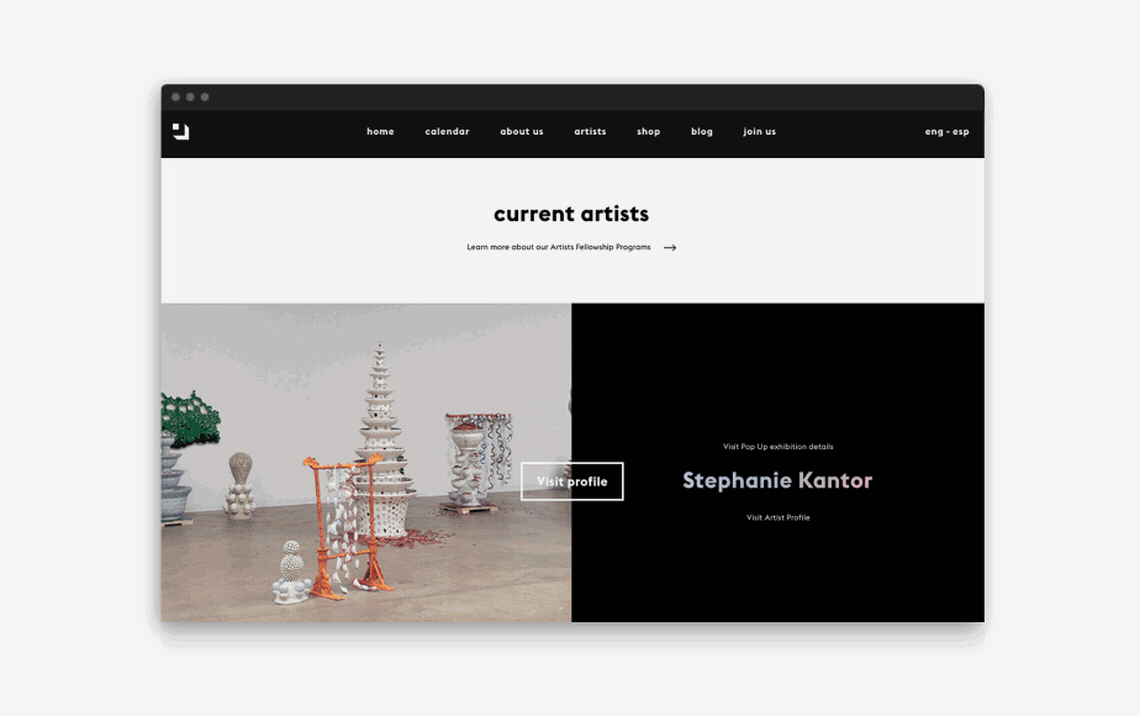
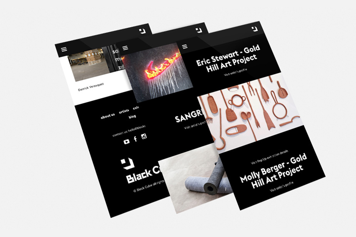
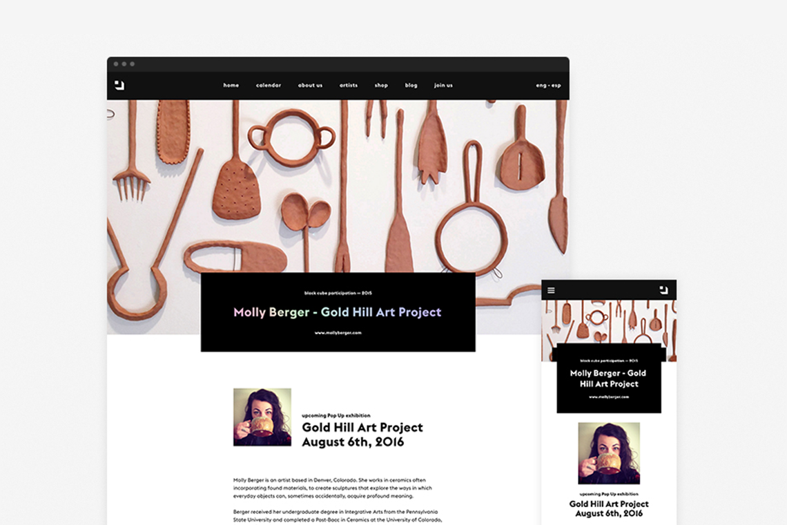
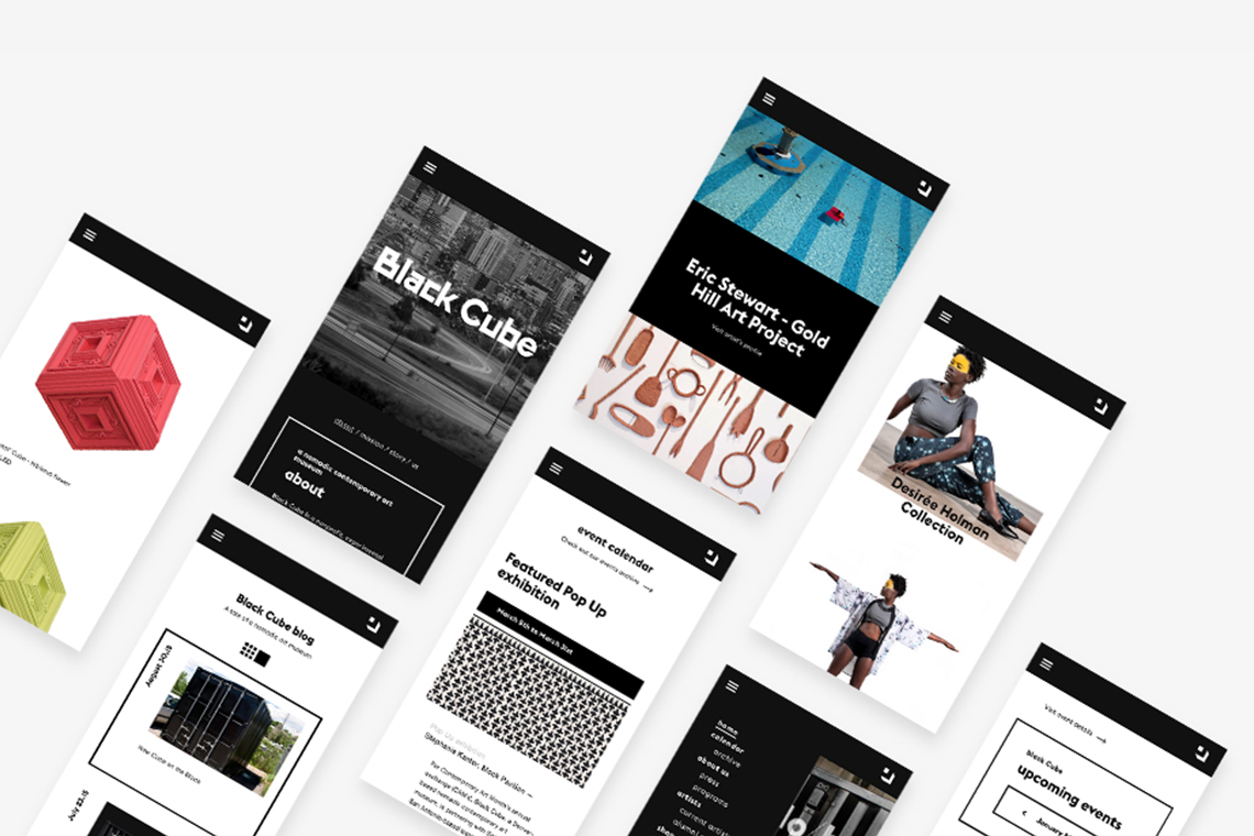
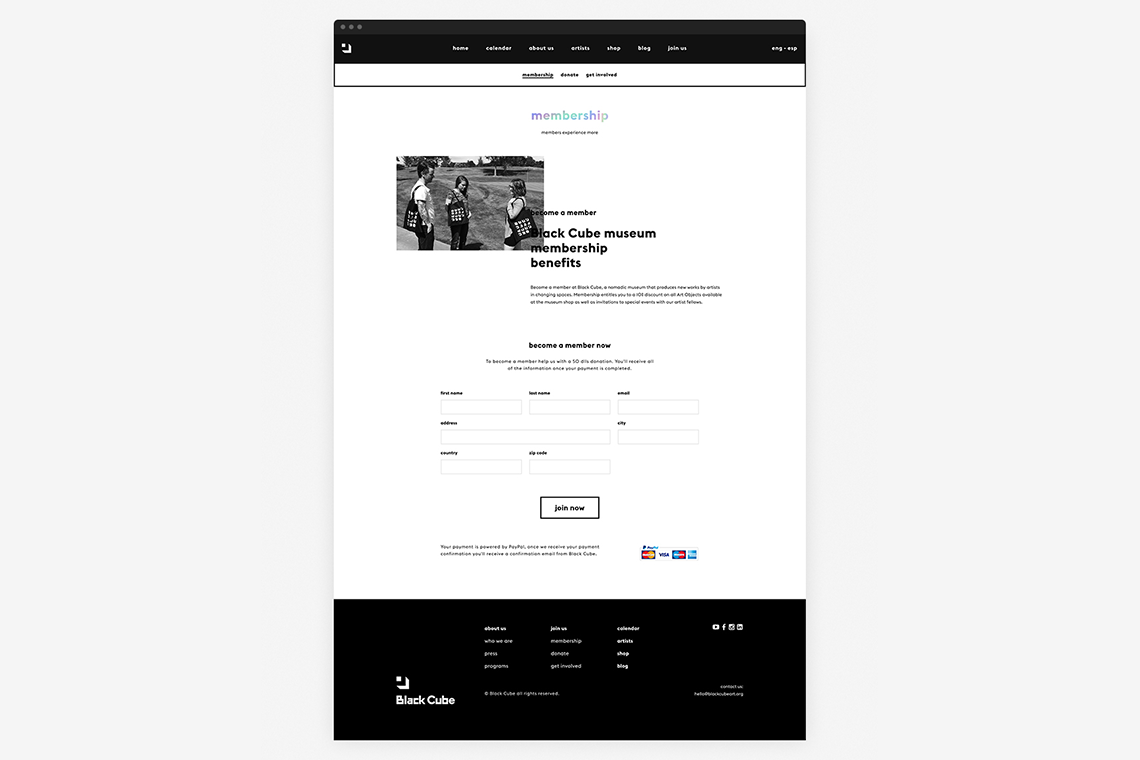
The website lets the user navigate from an artist's profile to their current or past exhibitions allowing them to explore new emerging artists around the world as well as learning how to get involved with the museum and become part of Black Cube’s experience.
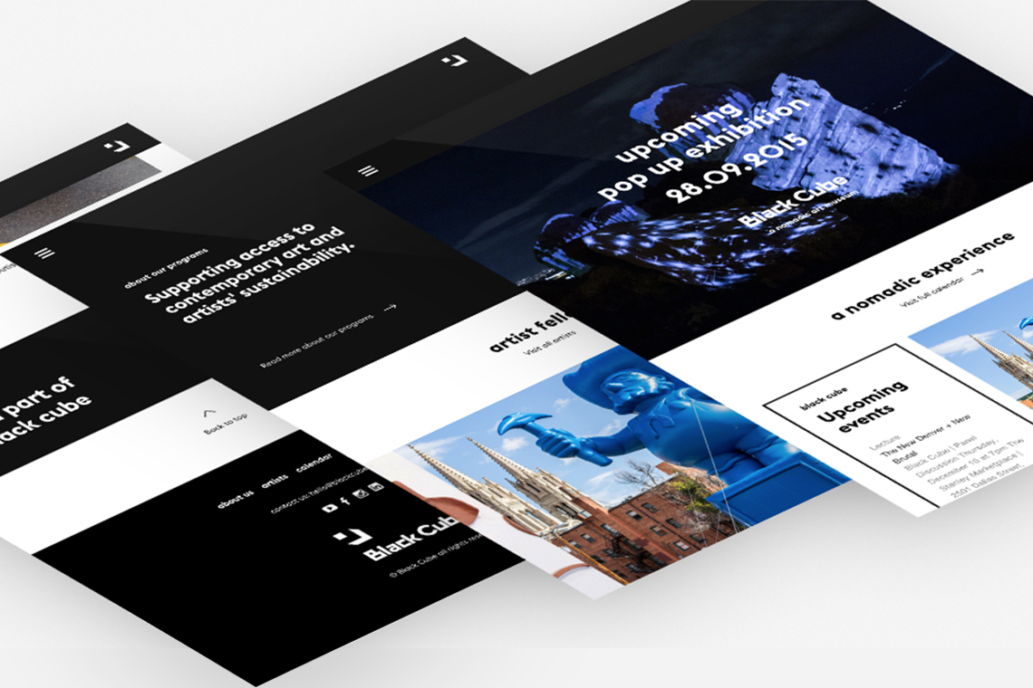
To address dynamism, we transformed simple elements (such as titles) into distinctly visual experiences influencing people to discover and appreciate contemporary art beyond traditional museums and gallery walls, being that, one of Black Cube’s main goals. — (A)
The website lets the user learn how to become part of Black Cube’s experience.
Black Cube
BRANDING
the objective
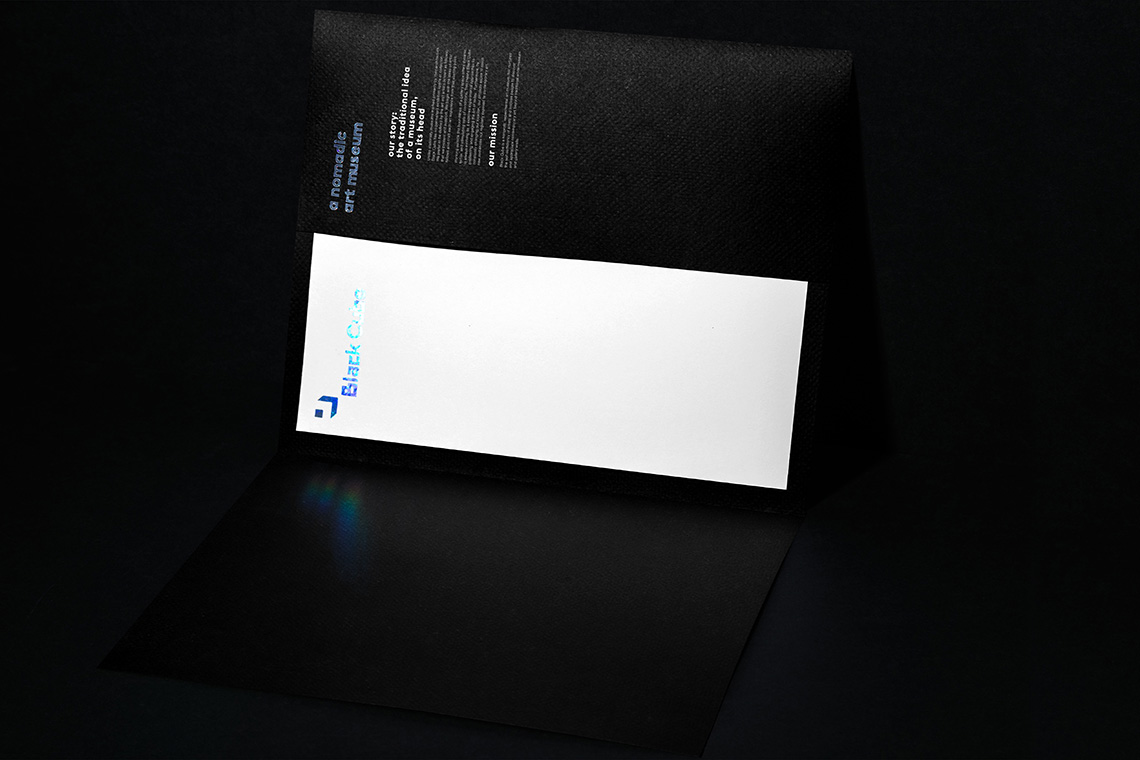
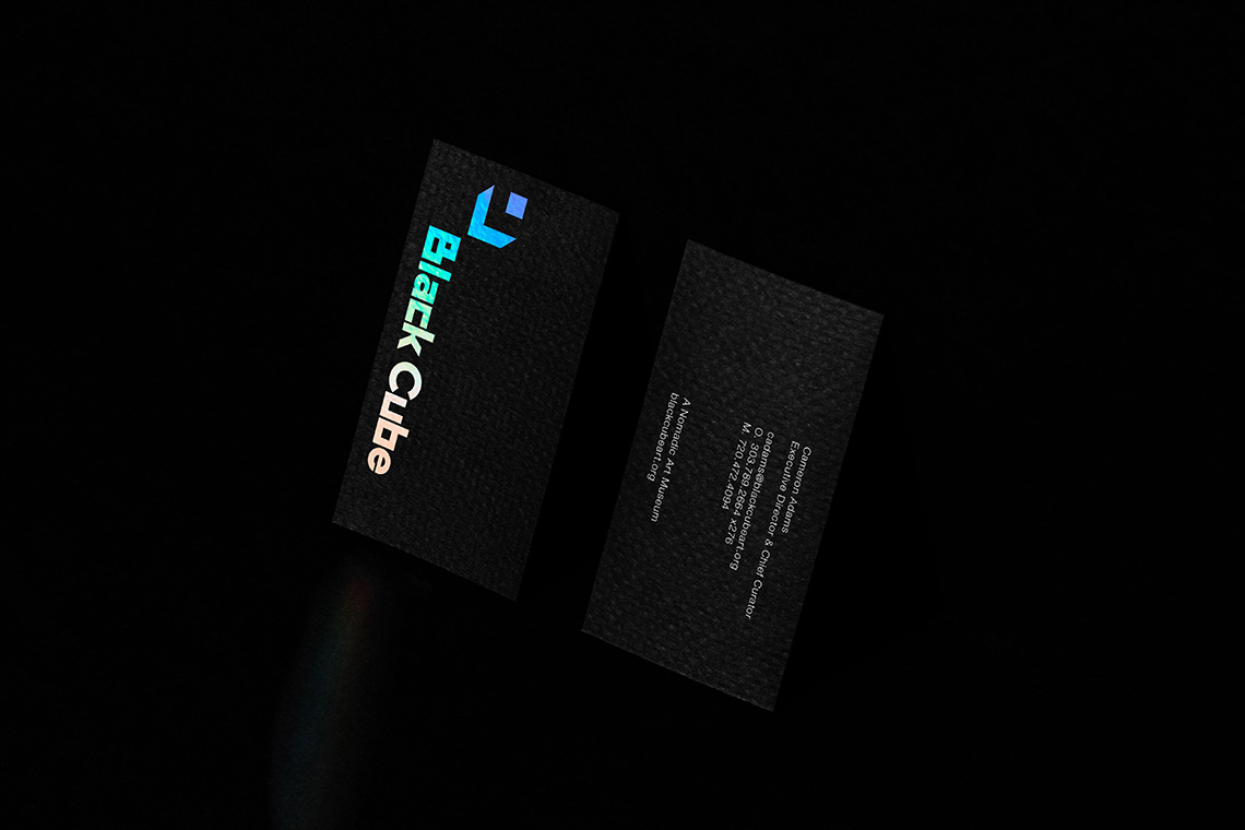
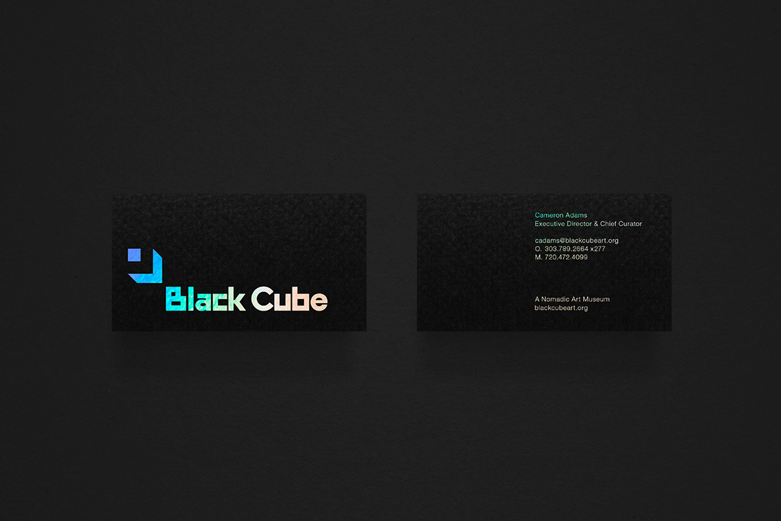
Create a brand that communicates the objective of Black Cube through an artistic and cultural behavior that connects with the art industry.
the solution
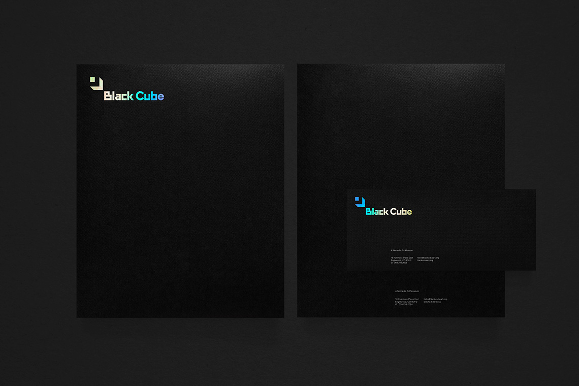
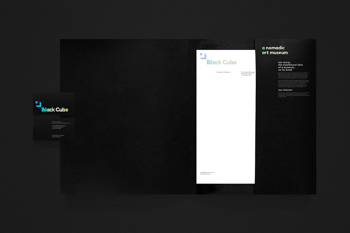
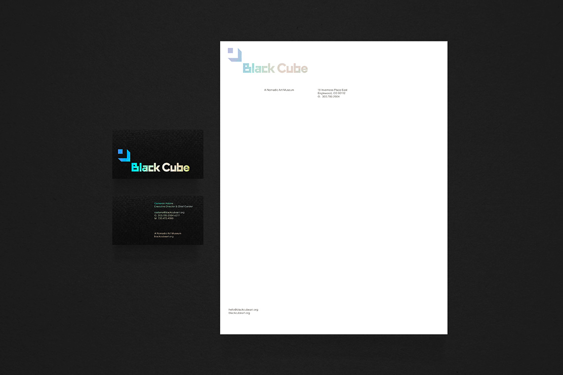
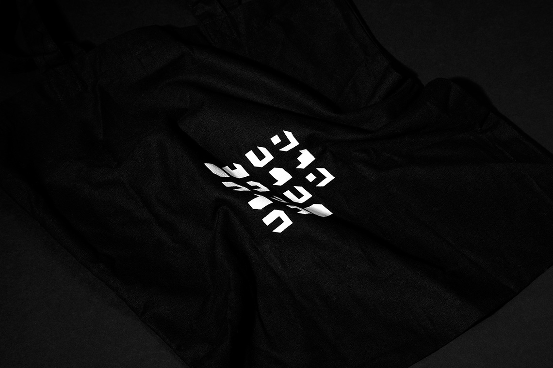
Our brand proposal was thought out as a design that could coexist with any art style. The neutral personality of the typography and color palette answer harmoniously within the context in which they are presented. The brand geometry expresses inspiration from the project and complements itself with an icon that lives in movement along with the project’s constant geographic relocation. — (A)

A brand that could coexist with any art style.