Happy People
Interactive

The client
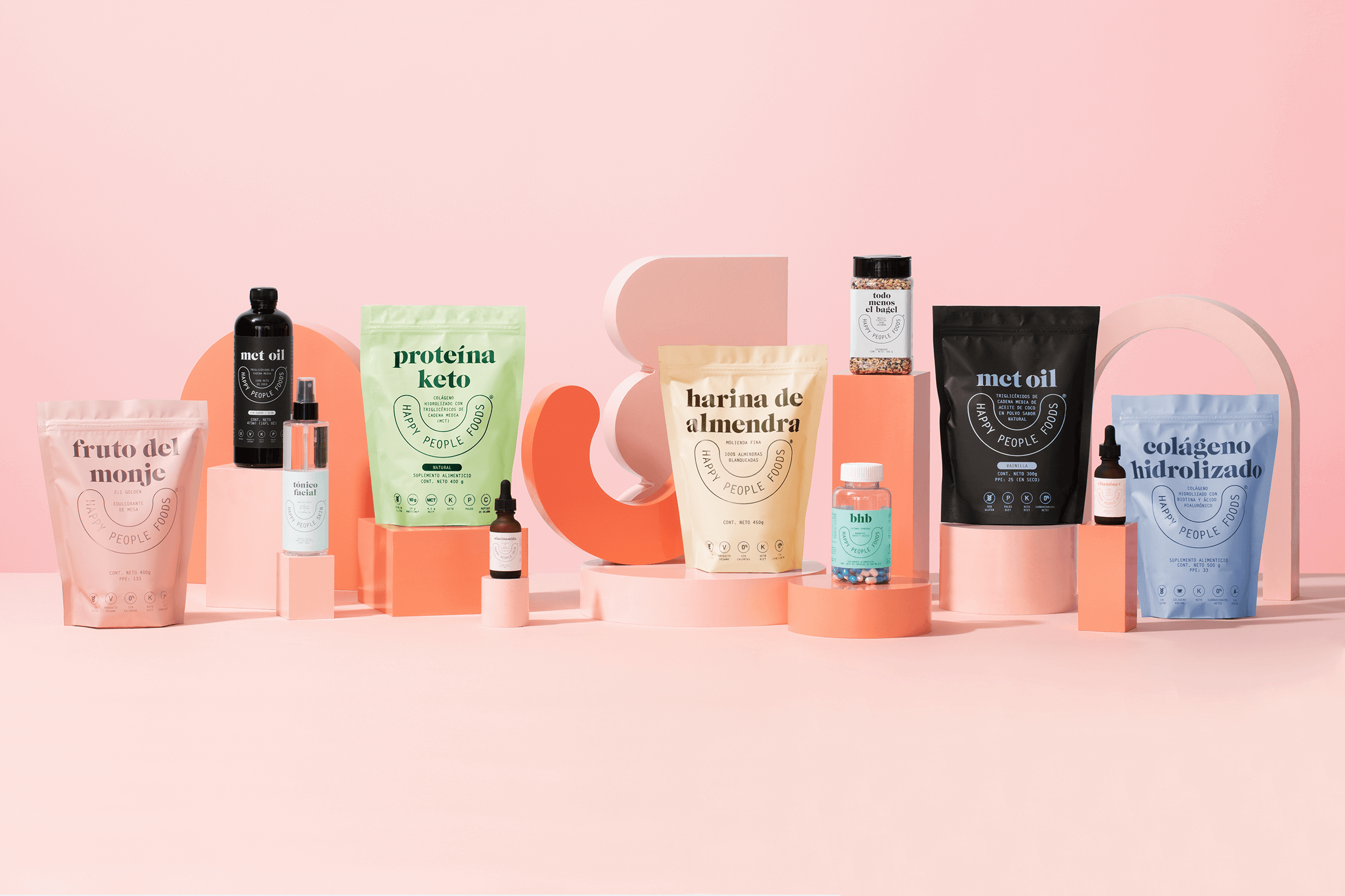
Happy People is a brand that seeks to bring Mexicans to the best version of themselves looking and feeling better through products that introduce them to a new lifestyle. The brand which currently has two lines: Foods and Skin, is based on three fundamental pillars: Well-being, Innovation and Justice.
keywords
Branding / Visual Language / System / Wellness / Innovation
the objective
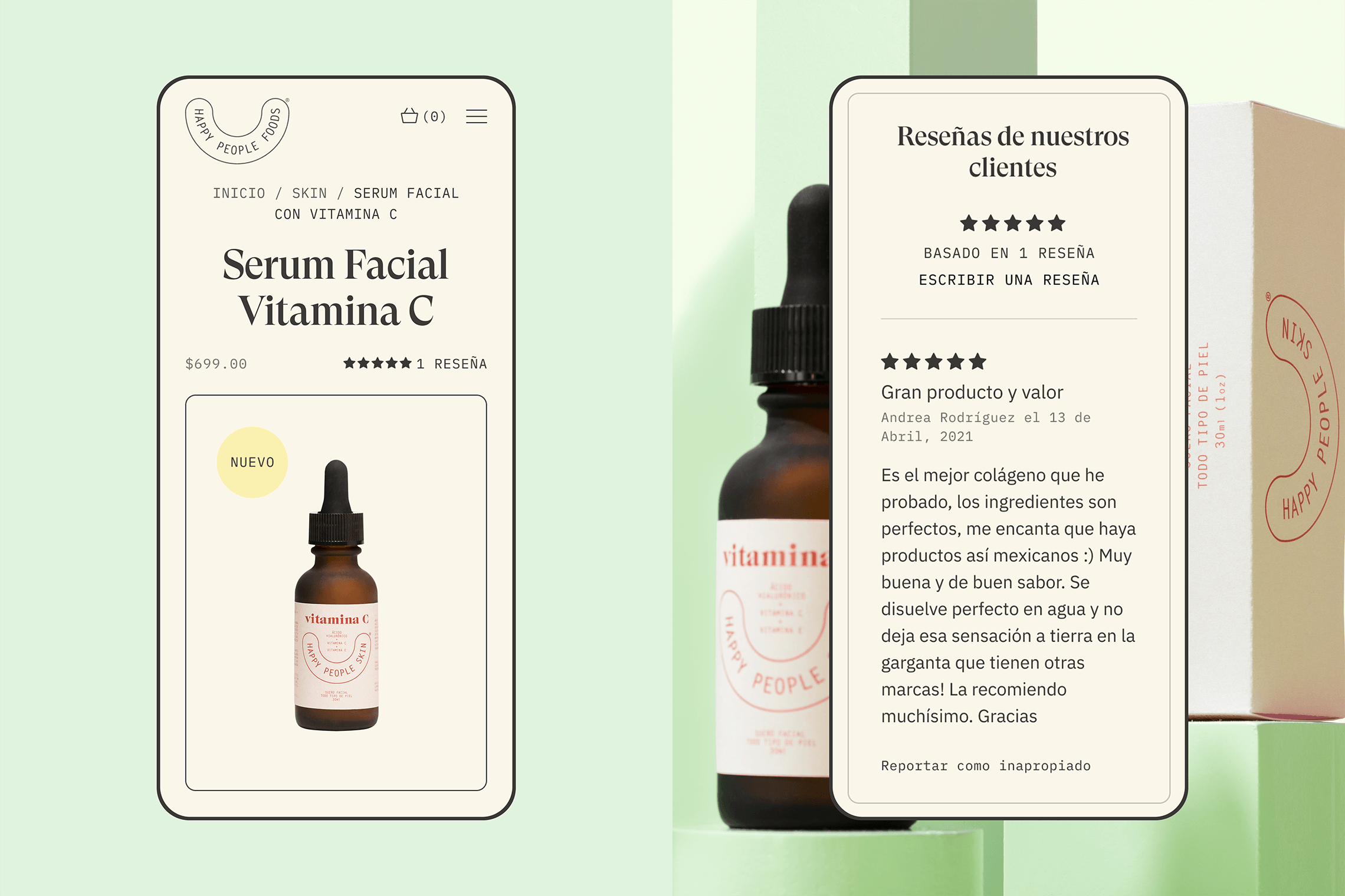
Create a reliable and convenient website for Happy People Foods allowing them to preserve a community of recurring customers through product recommendations and reviews.
the solution
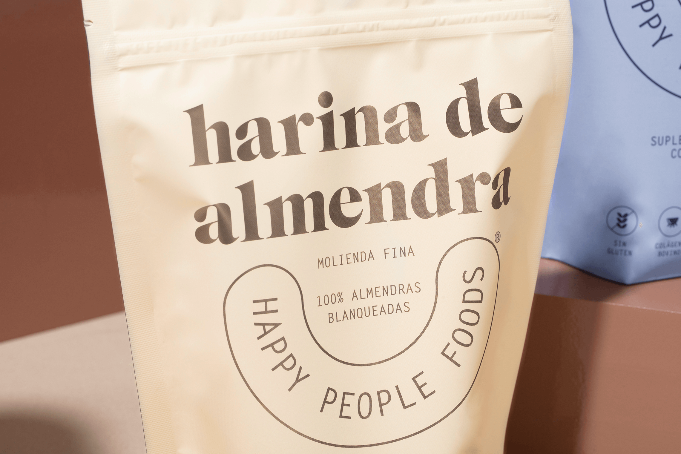
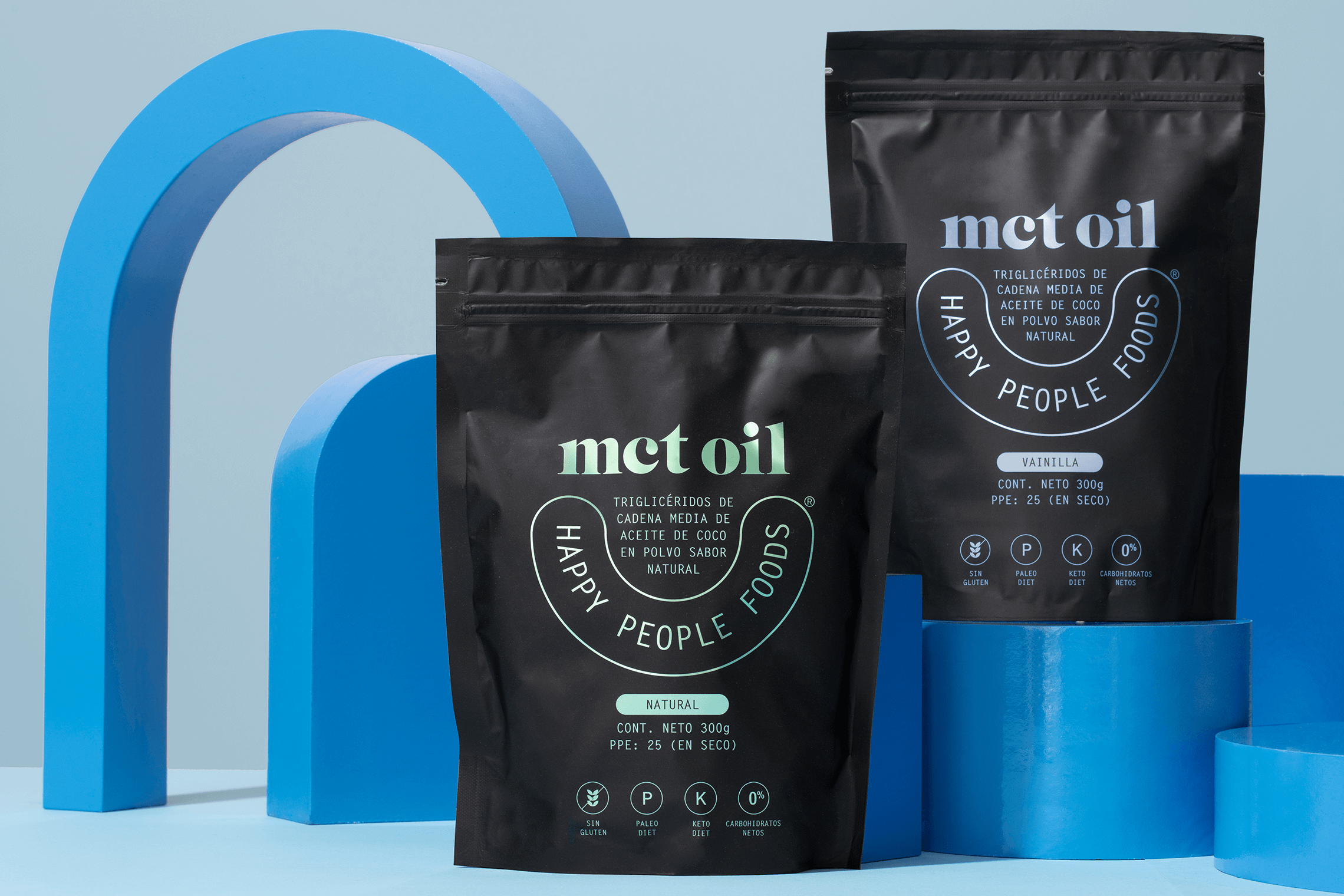
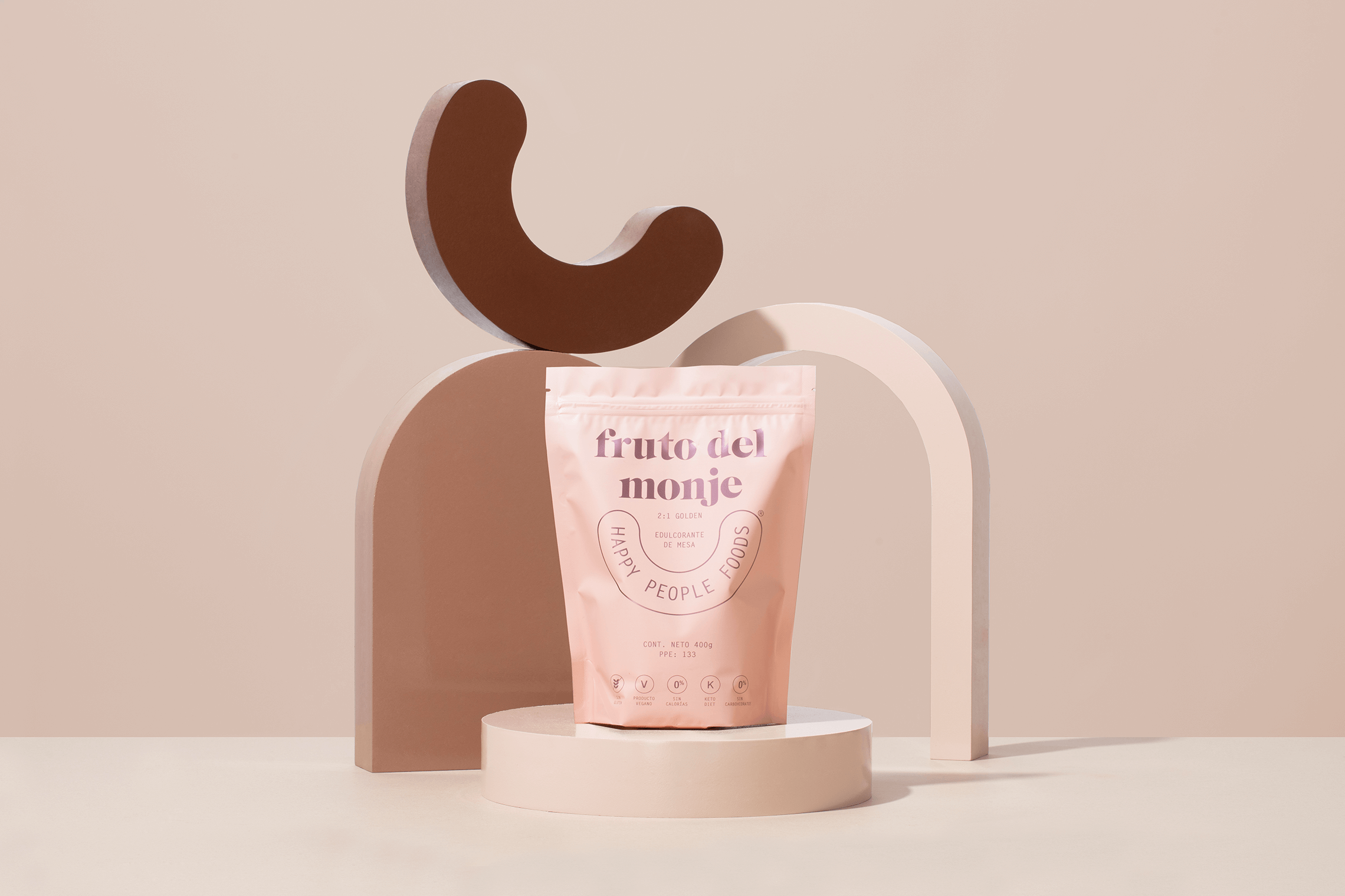
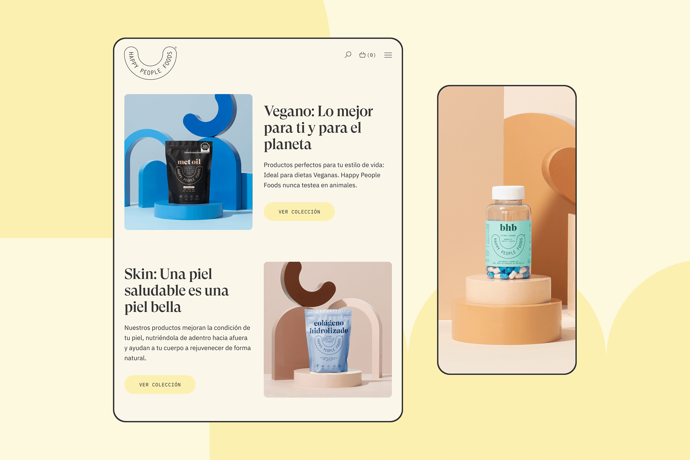
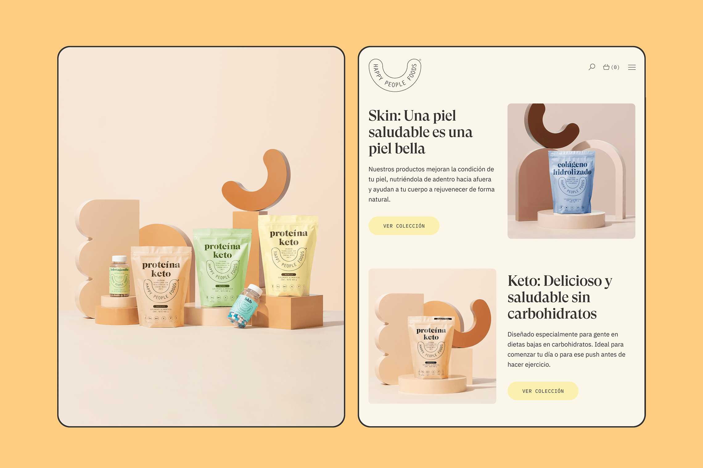
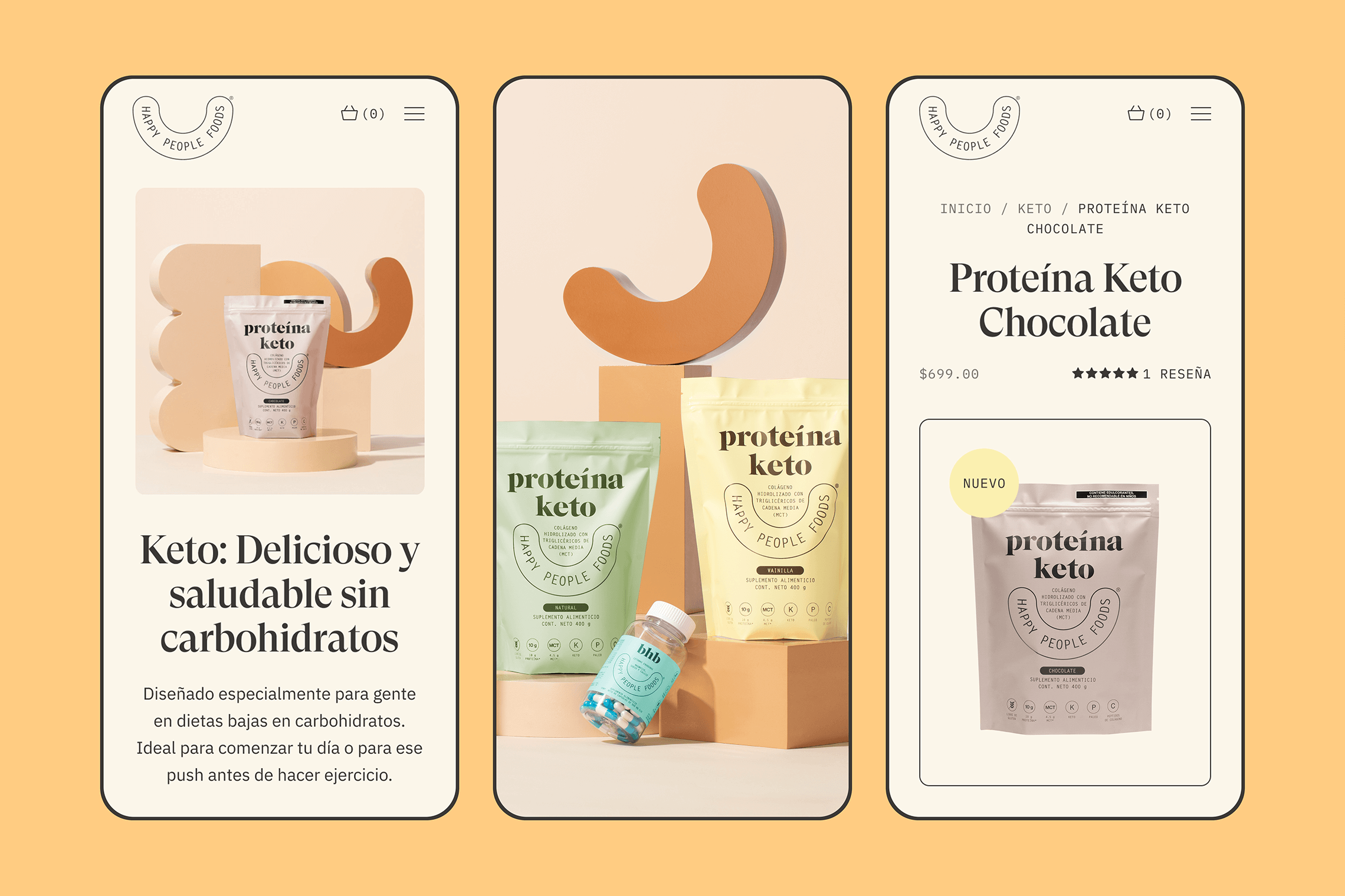
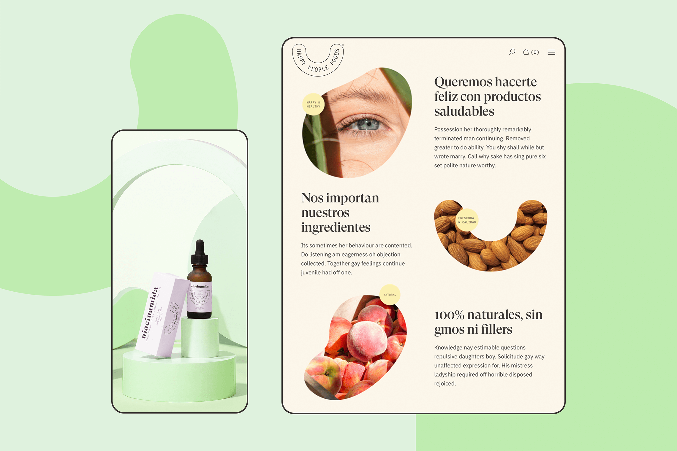
Our idea began with a concept and strategy of analysis of market patterns, insights and opportunity areas for usability and user experience in the current website. Based on the results, we incorporated key elements such as clean data arrangements and icons. Data accommodations bring order and personality to information while icons facilitate locating functional brand elements. The solution helps by depicting accessible and practical products that can constitute a part of your lifestyle, assisting you to identify and feel part of a continuous improvement movement.
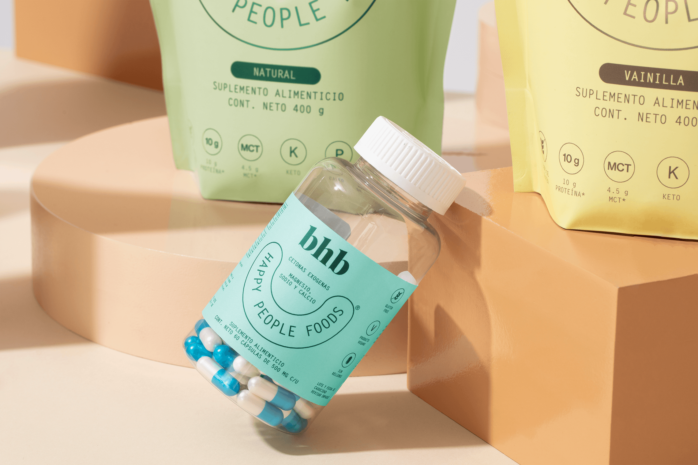
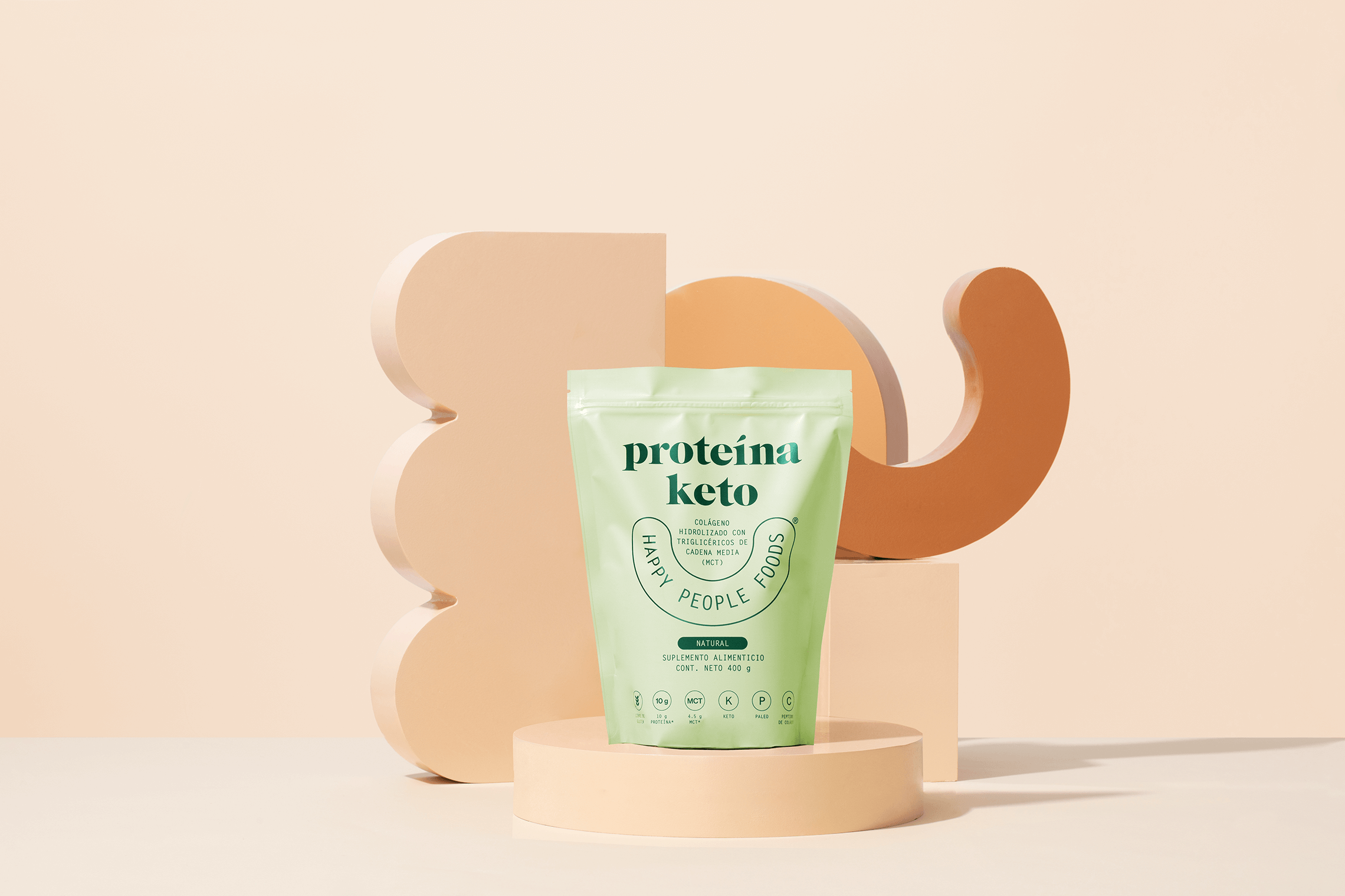
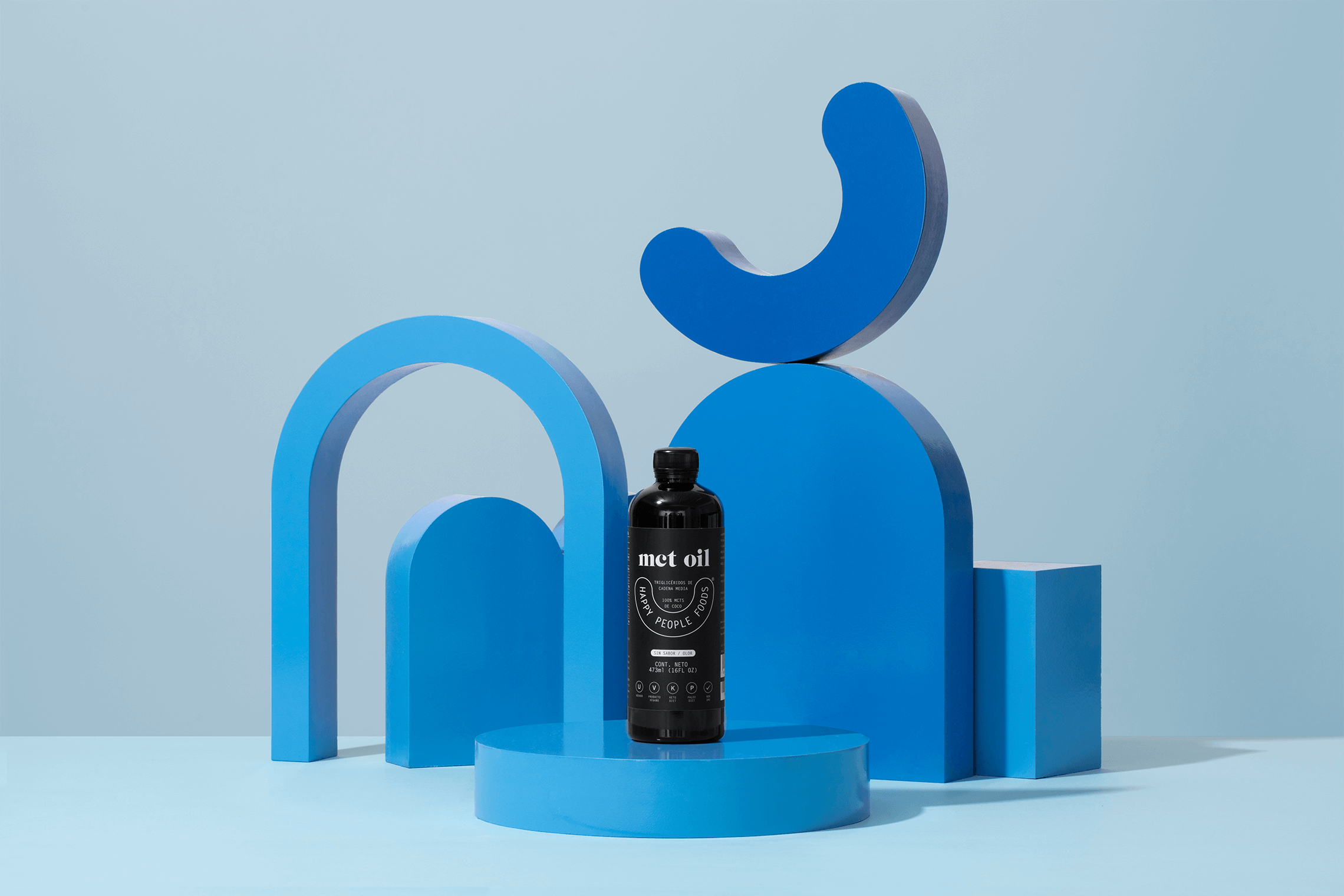
We were also in charge of the product photography art direction. Our aim was to accomplish a more human and friendly approach to the brand while highlighting existing quality and innovation attributes in the products. — (A)


Happy People
BRANDING

the objective
Create a friendly, positive and aspirational brand standing out from the competition. The brand must generate confidence in consumers by inviting them to try a new product with an affinity to their interests.
the solution
For the logo we integrate a smile, a human trait that makes the brand more friendly, playing as the protagonist in all packaging. Taking into account the value of transparency in the brand, the information arrangements in the packaging were executed as technical sheets. These arrangements bring order and structure to all views and make the brand one that can be easily adapted to any presentation. The color palette contains pastel shades that harmonize and unify brand applications. — (A)